All of these are influenced either by History text books aimed squarely at the children’s market, or by mindless meanderings amongst junk journal videos on YouTube. I feel that they are teetering on the brink of becoming interesting, but with the proviso that, by way of warning, there should be a sniff of disappointment in the air.
In a career that spanned just 6 years and ended at a mere 25 years of age, Beardsley produced more than a thousand drawings.
Photographic print processes appeared to rise up to the challenge of doing justice to his work. A zinc line block process faithfully reproduced the seas of black ink intertwined with complementary tendrils of white. These formed stylised representations of the human form engaged in the heights of emotional ecstasy as well as the depths of what some might term depravity.
Beardsley, a man of independent fortune, appeared to be free to roam with his visual depictions of the overtly sexual human form. There seems to have been little in the way of societal prohibition through which to curb his fantasies and therefore effect his outcomes. Perhaps with no ‘master of the wallet’ to dampen his soul and keep the reins taut, Beardsley allowed himself to run creatively amok.
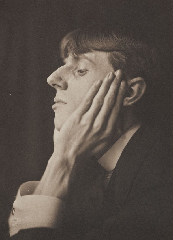
Self Portrait (1892) Aubrey Beardsley
References:
Calloway, S. et al. (2020) Aubrey Beardsley. London: Tate. Tate (no date)
Better late than never. It’s been a month or so since I received formative feedback on assignment 2. The main matters arising were as follows:
Matters Arising from (in no particular order) Introduction to Linocut
1)Transfer Blog to OCA Spaces for reasons of ease of navigation.
Although I initially agreed that this was a good idea, I realised that in order to do so I would need to use my OCA email address to link the content of my blog when thus transferring it. As I shall ultimately lose my email address at the end of my studies, I decided to remain with WordPress as it means I get to keep all of my work online.
2) Draw more often from source
This I have tried to do using objects that are around me such as cars and people in the park.
3) Do more research posts and make them overt so that they can be easily found on the blog.
This has been started, in that I have added the relevant category “Formative Feedback” and “Reflection on Formative Feedback”. I am finishing this task once this particular reflection piece has been completed.
4) Michelle was genuinely pleased and impressed by the quality and the quantity of Printmaking in evidence in my portfolio.
She gave me pointers on artists such as Edward Hopper, Vanessa Gardiner and Martin Lewis. She recommended mind mapping my decision making process on which life form to pursue during the following Part of the unit.
My next assignment is due 16th April 2021.
Summative Assessment will take place as intended in November 2021.
I thought that these images had been produced by some kind of printmaking method. I did not realise that they were acrylic paintings on board. They are highly reminiscent of early, and rather clumsy, attempts at representing landscape in computer animated simulator machines devised for the purpose of training pilots how to land helicopters and the like in dangerous situations and environments.
City Wall (2018) Vanessa GardinerTrevalga (2018) Vanessa Gardiner
I don’t really know what else to add to my comments on these works. I think I approve of the fact of their minimalism. The colour choices are in keeping with the natural world of landscapes, but I wonder whether a more urban subject matter may enhance the effect of the chosen medium/method. A few colourful buildings and even a few figures sprinkled about? But then the artwork, and what it sets out to achieve would be transformed. Perhaps that’s not the artist’s aim?
I confess to not knowing what the artist intended. A minimalist outcome has been achieved. But has anything been added by reproducing very similar images using the same method other than the obvious increased quantity?
Question: Does my opinion require triangulation by others’ views in order that it may be correctly positioned on the Art Map, and therefore be placed in some context?
I feel that, in putting the question quite that way, I may have hinted at the conclusion to this post. Perhaps for the sake of minimalism I should shut up now?
But the Devil makes work for idle hands, so I continue…
If I were to say, “I like Picasso.” You’d be forgiven for thinking ; “so what?”.
If I said; “I like Picasso because…” this would be an improvement on “I like Picasso.” (Which, if true, is a mere statement of fact).
Better still would be; “I think Picasso was a derivative self-publicist.” Though, it could be argued that this is also a mere statement. But whether it is true is another question. How to verify fact from opinion is also another branch on the Art mind map.
So, how to verify or give validation to a point of view? Other than being an upstanding citizen of a free world and therefore entitled to my own opinion, how do I verify if my statement of opinion is valid? Is it enough to say to a child, “because I say so,” when admonishing bad behaviour? It may just be bad parenting. But is it enough in any other situation where someone asks why?
All Art world contextual maps are subjective. Each artist, viewer, buyer or seller has a different view depending on their background and current environment. Should we allow our views to be either swayed or reinforced by that of others, or is this just another step on the road to something like religious zealotry?
I feel that triangulating facts in order to verify them as such is valid. As regards fact vs opinion, it is important to discern the difference between the two and then act according to one’s values. My values tell me that if I state anything not verifiable as fact, it is therefore defined as my opinion (or a jest). My opinion is not beyond contention. If I state, “The dog is pink”. Perhaps its verifiable as fact. If I say, “all dogs are pink”, I hope you will agree that this is questionable information.
Due to its atmosphere of impending drama, this aerial view Night Shadows (1921) could easily be a panel from a graphic novel. This evokes a feeling of mystery unravelling before our eyes. There is plenty of scope for the later addition of thought bubbles etc as the character in the hat considers where he has just been or where he is ultimately headed.
Night Shadows (1921) Edward Hopper
In 1923, after winning two prizes for etchings he had produced between 1915 and 1923, Hopper turned his attention back toward painting once more. The output from this was in turn influenced by his subject choices and compositions used for his etchings. I feel his work was over all influenced by the severe contrast necessary to produce outcomes with impact whilst printing using only black ink. These stark images speak of urban stories untold.
Night on the El Train (1921) Edward Hopper
Here is what could easily be interpreted as either a representation of a couple about to be engaged in an embrace whilst travelling by night on a train, or an innocent and unsuspecting man being cornered and harassed by a strange woman. The atmosphere created by the composition hints equally at either narrative. Again, a caption would not not be out of place here.
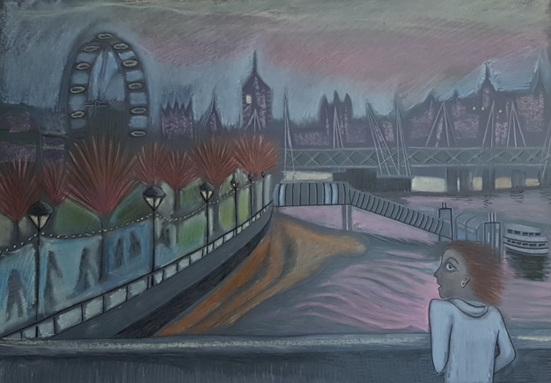
Again, I refer back to my composition, Waterloo Sunset (2020) to show that these influences have made their mark, even if I was not aware of these artists at the time, their output is not unfamiliar to me from browsing online and from magazine articles on printmaking etc.
Waterloo Sunset (2020) Maureen Walker
Landscapes such as these, once the addition of a figure or two has been made, become stories in the making as we ask ourselves, What? When? Who? Where? or Why?
There’s something about this image that speaks, screams of the seedy underbelly of a city by night. The fact that there is line upon line of washing hanging out to dry, places this piece in a time before the pervasive hum of the tumble drier seeped through the walls of one’s high rise flat and directly into one’s subconscious.
Across the gardens we can see that all the lights are on in the windows. Judging by the dated clothing worn by the figure in the foreground, this is somewhere between the wars. But, of course, the date of the piece (1929) kind of gives the game away.
This piece illustrates the hours following having worked fingers to the bone. Whether that be at the coal face, or at the punishing front line of typewriter keys, the result is much the same. There is a feeling of sweat and tears about this image. The level of tonal contrast together with the composition – the foreground figure taking up about a third of the space from the left, and the buildings in the background using up a third of the horizontal plane. It puts me firmly in mind of my drawing “Waterloo Sunset” due to the figure in the foreground being mirrored by my figure on the bridge.
Waterloo Sunset. (2020) Maureen Walker
However, where my figure is isolated by the scene and appears vulnerable, Martin Lewis’s female figure, whether she likes it or not, seems to be very much at home, or at least resigned to the fact that she is present in her home environment.
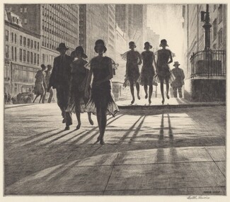
Looking at his other works it is clear that Martin Lewis was a huge fan of the long shadow. Here is a good example.
Shadow Dance (1930) Martin LewisMorrison’s Crowd (2020) Maureen Walker
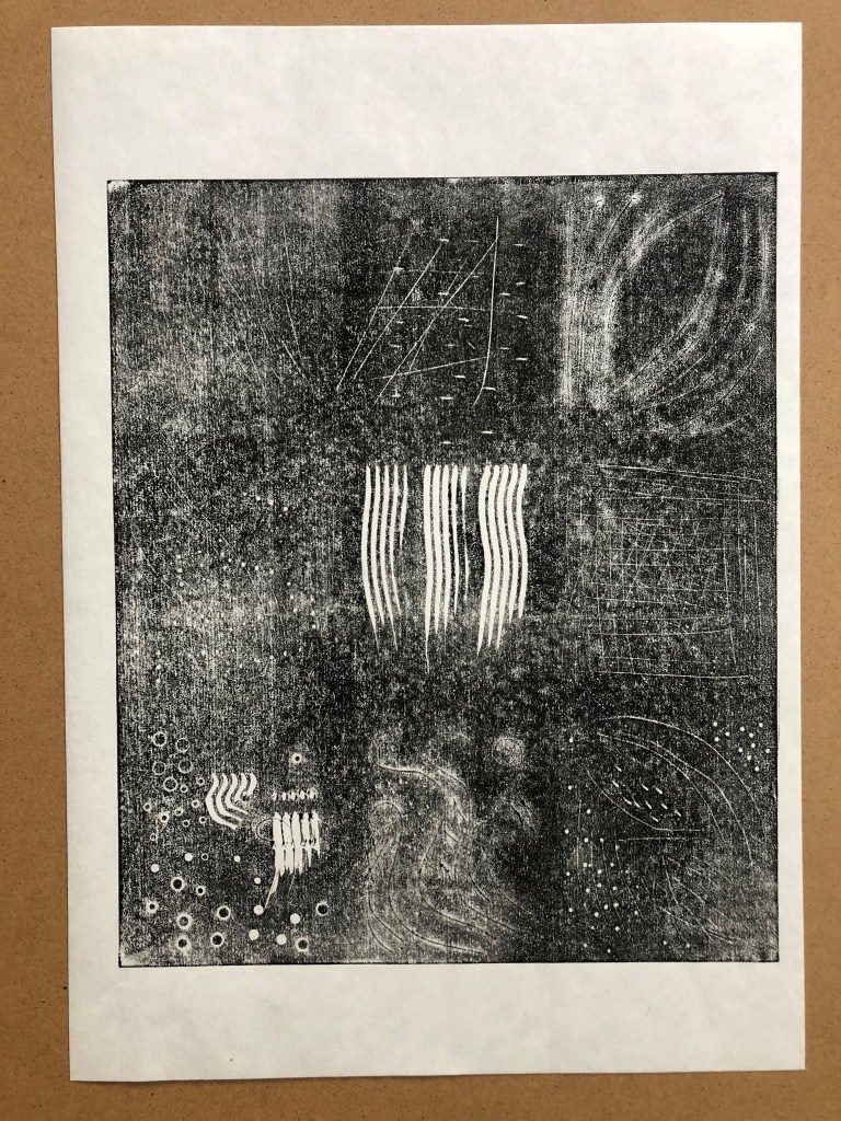
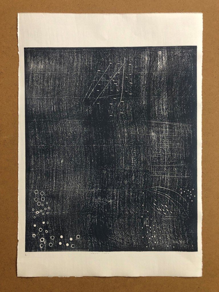
Hopefully, there are discernible squares marked out on this Lino plate. They were numbered 1-9 reading top down, left to right. The tools used to cut into, or at least to mark the the surface of the lino, are as follows.
Steel intaglio tool, double ended. I used both ends of this tool. I pressed both the end point and the side curve into the lino. I found that this created strong marks in the lino which in turn printed clearly lines and dots.
Exacto knife. This cut very fine lines, as perhaps one might expect from a sharp knife. The deeper the cut the more unwieldy this tool became so that my attempts at cutting curves into the surface of the lino became angular in nature. Post print these registered as dark lines instead of white as the cut marks simply filled with ink.
Hole punch and eylet setter tools. These two tools were limited in their reach beyond the edge of the lino. These could be used effectively as border tools perhaps. Maybe for the centre of a flower or a jewel? Post print these printed as clear and perfect circles or little eclipses (sic)
Tweezers. I wasn’t expecting a great deal from these. They make marks of parallel lines and indents by pressing the tips into the lino. Post print these made clear lines as part of the print.
“Thing“. My partner provided this item. I suspect it’s a drill bit of some kind. It’s a bit like a cylindrical mace. I was unconvinced that anything would show up in the final print, as I simply rolled this item on its side along the lino. Post print it did however just show up as a uniform series of white dots.
Pencil/pen. These were good for drawing onto the lino. When it came to printing they barely showed up at all. Using a biro I drew a simple figure which was not clear on any of the prints.
Hacksaw blade. This was satisfying to play with, making obvious score marks in the very top of the lino surface. I felt confident that the print would show these marks clearly, however, they were not as obvious as all that. They were ink-filled lines, so black on black.
Bulldog clip. Parallel lines like the tweezers – bit deeper. I turned the clip onto its edge and scored lines that show clearly in the lino. I then made dents with the corners of the bulldog clips. Post print these were clear white lines and dents in the print.
Sandpaper. This made nice highlighted areas on the lino but did not show up whatsoever on the print. I then used the edge of a Philips screwdriver to make bark-like impressions but these showed up in the final print as mere lines.
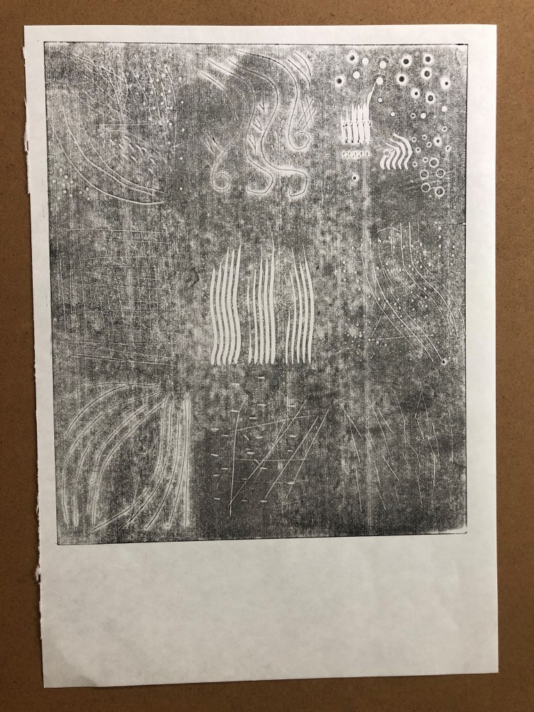
At first I suspected this exercise to be a waste of time, effort, resources and of my patience and personal safety in using blunt tools where well-maintained tools are prerequisite.
If planning to do any kind of lino cutting, you can’t really go too wrong with a set of decent lino cutting tools. Rather than attempting to reinvent the wheel using a fork or a knife, for example, what’s wrong with simply investing in a good Pfeil set?
However, I persevered. I tried stabbing the lino with a fork and dragging a Philips screwdriver along the surface of the lino. This did not change my view, until I tried to cut using a zester.
I made several marks using this tool from my partner’s kitchen. As well as this, I used a standalone hole punch which, by simply pressing the tip into the lino, cuts satisfyingly perfect holes every time, and wherever you wished to place them.
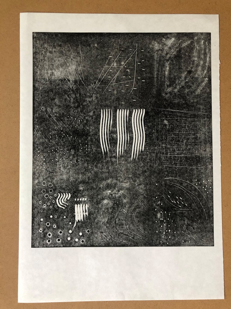
I used Somerset White 300gsm paper, Hosho paper, and Zerkall 120gsm for this project. I have not varied the ink colour particularly. I was attempting to gain a clear representation of the plate by varying the amount of ink I applied rather than varying the colour.
Strangely, the best representation of the lino plate in print form has been by using the lightest touch with black ink. Each of the cuts in this instance are clearly visible on the lightly inked print. I intend submitting one other pre-zester print just for completion.
This blog post has corralled together an unusual grouping. The first is an obvious choice for an art student. The recent retrospective at Tate Modern, which I missed out on, included the instantly recognisable Marilyn Monroe portraits by Warhol, in all their unabashed glory. This art, with the colour and nutritional value of a fondant fancy, is at once unique, and trashily disposable. It captured a zeitgiest in a throwaway world where pop was king.
Andy Warhol attached himself to a beatnik counter-culture, associating with the music world via singers such as Nico and the band The Velvet Underground. A reputedly shy man originating from Slovakia, Warhol was a successful self publicist by proxy. He was reputed to have championed the career of Jean Michel Basquiat having met him whilst Basquiat was selling work on the street.
His images shout about celebrity and the nature of consumerism. A silk screen dream of the banal. But in amongst the brash and the infamous, the Monroes and the Campbell’s Soup Cans, was to be found a delicate sensitivity for the frail and transient nature of human beauty in the form of the delicate line drawing, “Boy with Flowers” (1955-57).
I hope to get a chance again to see his work in person. However I suspect this may not come my way twice in one lifetime.
Louise Bourgeois
The famous spider that took up temporary residence in Tate Modern’s yawning space during opening of Tate Modern in May 2000 is said to be a representation of the artist’s mother, or, at least representative of the artist’s relationship with her mother. A more rationally “phobic” symbol would have been difficult to find. Perhaps one could be forgiven for misinterpreting the relationship? Bourgeois said of her mother that she was, “deliberate, clever, patient, soothing, reasonable, dainty, subtle, indispensable, neat, and useful as an araignée. She could also defend herself, and me, by refusing to answer ‘stupid’, inquisitive, embarrassing personal questions.”
Seen from below there are eggs cradled within the arachnid’s giant abdomen. Did Louise Bourgeois feel like those eggs? Vulnerable enough, I’m certain. To be faced with the drop from such an unconventional embrace? And that is your childhood? To be so cradled? I do wonder whether, through being handled thus by her nearest and dearest, Louise Bourgeois was then driven to produce art far beyond the imagination of other mortals, who instead enjoyed the comforts of a warm fur-lined basinet.
My Inner Life 2008 Louise Bourgeois 1911-2010 Lent by the Tate Americas Foundation, courtesy of the Easton Foundation and Osiris 2016 http://www.tate.org.uk/art/work/L03833
The Voice Says Yes 2009 and I Give Everything Away 2010 were a series of etchings by Louise Bourgeois. These appear to be abstract representations of how she feels about “being”. I confess that I have been to so many exhibitions in the past that I’m not certain whether I saw this one, or if I simply caught these images online. Context is so key and this exhibition took place prior to my commencement of the degree course. Placing it in the context of an important exhibition from an artist nearing the end of her life, was not in my mind at the time, if in fact I was even there.
Yong Ho Ji
Scratching around for some originality in representing animals in art I found myself rejecting the cute and cuddly in favour of those more phobia-inducing critters. Yes, spiders included. This artist is included as contrast, a bit of fast food in the midst of Cordon Bleu.
I suspect there may be a risk of becoming a one-trick pony for this artist who has made a name for himself by cutting up old tyres and rearranging them to form wild beasts. I do hope he doesn’t meet this fate of typecasting. I included “that Korean tyre guy” in my trio of lifeform representational artists, as he too includes a spider-like creature with just three legs. This tri-ped appears less caustic and dangerous than Louise Bourgeois’s spider, possibly due to the artist’s chosen medium. One imagines if it were possible to touch one of his sculptures that it would be slightly warm and give way to a degree under the slightest pressure. This is in stark contrast to the Bourgeois spider which is serious in its portrayal of humanity. The Bourgeois spider looms large and out of reach to mere mortals. Yong Ho Ji’s creature gives the impression of being prone to toppling and having its belly tickled at a moment’s notice with little risk of remonstration.
The medium, recycled tyres, does at least remind me of the wasted resources we steal away on a daily basis from our fellow creatures and the tentative hold we each have on life on earth.
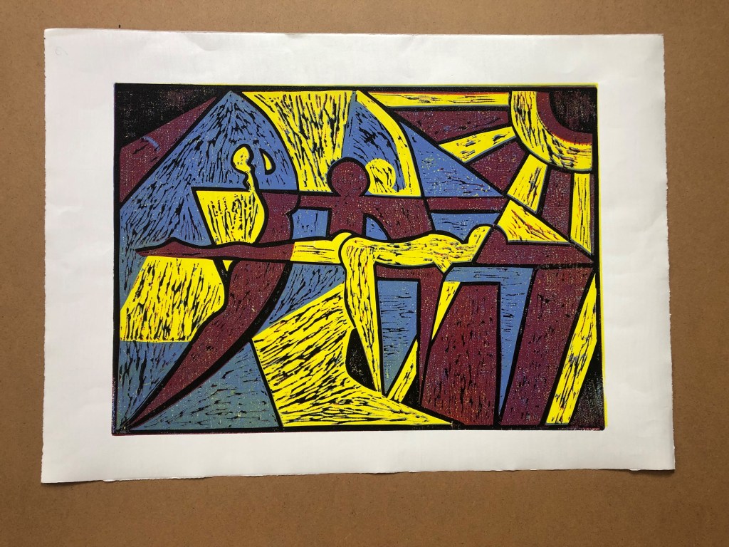
Over all I am fairly pleased with the outcome of this first reduction print. There is not much I’d do differently. Perhaps I’d be a little less concerned about inadvertently creating lascivious outcomes and stick to my original design and do less designing “on the hoof” so to speak. I was thinking in particular about the area immediately behind the central figure whose leg is extended. My concern was that she appeared overly exposed, but feel my prudishness may have had the effect of rendering the central figure behind her a little off balance as I removed a block that would otherwise have been darker in colour and so she appears to have only one leg to stand on. This hasn’t spoiled the composition though, as it is quite abstract in nature, as was my intention.
I think that it’s okay to react to how the design actually looks on paper once printed. On the whole, designing at the outset and then sticking to a plan is probably best. But the nature of printmaking is that outcomes are not always so predictable. It is tempting to change one’s mind part way through and make adjustments accordingly.
I am happy with the effect of the residual cut marks being in different directions which implies movement to the scene. It also has a furry quality which I may use in the next exercise.
My thinking behind this design was to create something of an homage to the poster designs of the roaring ’20s. In creating this piece, I am satisfying my need to bring a sense of hope to the viewer. The themes of optimism towards the future of human interaction (in the current COVID climate) speak of a new attitude. Being that bit older than the average student, I am aware that human experience involves peaks and troughs – not only as individuals, but as a species. I think an atmosphere of devil-may-care may prevail again, just like that brief spell of respite between the two world wars. My hope is that this will not be quite so short-lived. I look forward to a time when people will come together in groups once again to celebrate life, health, and a sense of mental well-being, with all the benefits that has to offer.