Assignment 2: Reflection on Formative Feedback

Better late than never. It’s been a month or so since I received formative feedback on assignment 2. The main matters arising were as follows:

Matters Arising from (in no particular order) Introduction to Linocut

1)Transfer Blog to OCA Spaces for reasons of ease of navigation.

Although I initially agreed that this was a good idea, I realised that in order to do so I would need to use my OCA email address to link the content of my blog when thus transferring it. As I shall ultimately lose my email address at the end of my studies, I decided to remain with WordPress as it means I get to keep all of my work online.

2) Draw more often from source

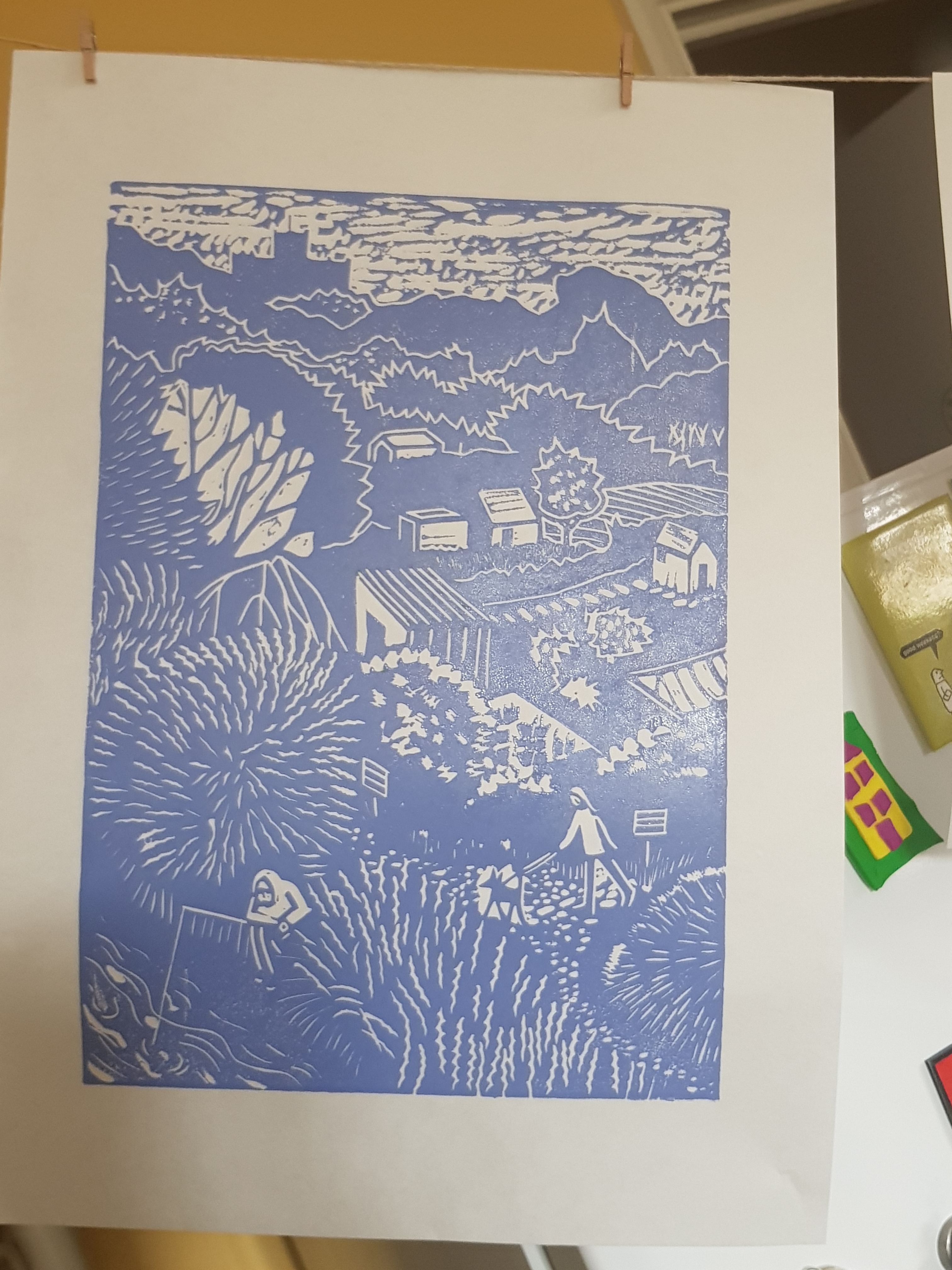
This I have tried to do using objects that are around me such as cars and people in the park.

3) Do more research posts and make them overt so that they can be easily found on the blog.

This has been started, in that I have added the relevant category “Formative Feedback” and “Reflection on Formative Feedback”. I am finishing this task once this particular reflection piece has been completed.

4) Michelle was genuinely pleased and impressed by the quality and the quantity of Printmaking in evidence in my portfolio.

She gave me pointers on artists such as Edward Hopper, Vanessa Gardiner and Martin Lewis. She recommended mind mapping my decision making process on which life form to pursue during the following Part of the unit.

My next assignment is due 16th April 2021.

Summative Assessment will take place as intended in November 2021.

Part 2: Project 7: Multi- Block Print: Conclusion

“Bottle Alley, Hastings”

I feel that the above image conveys my intention to represent the feeling of isolation we are all experiencing right now due to COVID restrictions. Even my mistake of cutting in the wrong direction on the 4th lino plate has had the effect of an overgrown area around the tiled floor behind the benches. This hints at a gradual deterioration of environment. I had felt the need to create a 4th plate in order to lend definition to the benches, which had been lacking in previous prints using plates 1-3.

Lino plate #4

I used the following image as a starting point for this scene, it is a lonely spot at the best of times. But out-of-season during COVID appears to be so desolate a place. I was very pleased to have noticed this spot and captured it from this particular angle.

Original inspiration taken between lockdowns 2020
My artistic impression sketch

I was inspired by the minimalism of artists such as Paul Catherall with his prints of recognizable buildings such as Tate Modern, for example. I feel that his ability to simplify images down to their essential components holds the key to creating impactful outcomes. I feel I could have benefitted from working my “Bottle Alley” print on a larger scale. The effect of multiple layers has tended to confuse the image (A5) at these dimensions.

I shall be submitting the following for task 3 of Assignment 2. These prints for Project 7 were concluded over the weekend, ever mindful of my self-imposed deadline of this wednesday to submit, or at least to post my portfolio.

Print from plate #1
Print from plate #2
Print from plate #3
Print from plate #4

I have not made a print using all 4 plates as this would be confusing and lacking in contrast and therefore reducing impact. Instead I have included the following:

Plates #1 plus #3
Plates #1, #2, and #3
Plates #1, #2, and #4
Plates #1, and #4 (slightly offset) on Somerset satin white Printmaking paper
Plates #1, and #3

Most of the above prints were created with oil based ink on Hosho paper and were hand- burnished using a cheap plastic baren from a speedball kit. I have found this to be the best method for pressing, so far at least. Registration was achieved using a purpose – built jig.

This project has been an enjoyable challenge, if a bit tricky due to my inexperience and my choice of scale. I chose this due to the plates I had that were multiples of exactly the same size. I did not wish to mess about cutting down larger lino pieces and risk having them be misaligned due to inaccurate trimming etc.

I intend to go on to the next part of the Printmaking module having learned much of use from this exercise.

Part 2: Project 6: Single Block Print: Further Work

I’m starting to get decent consistent prints from this plate now. This is from using Japanese Hosho paper, oil based ink and by hand-burnishing only. The following prints will be submitted for Task 2, Assignment 2.

Japanese Hosho paper with gradations to the ink from green to yellow
Oil based ink on Hosho paper
Japanese Hosho paper

I tried adding gradations to the colour in the green print on Hosho paper. I think it’s quite effective, as though the sunlight is touching areas and leaving others in shade.

I feel that this piece, though initially inspired by a scene created by Jane Dignum “Poppies on the Allotment”, has more to do with the dictates of the governing state, as symbolised by an historical monument – St Albans Abbey – and how people’s lives, whether in their best interests or otherwise, have been and remain controlled from the top down. The eye travels down from this monument through the suggested toil of the land to individuals themselves as they go about precious leisure time. These people are essential elements of a scene to lend life as well as scale. They are also rendered almost insignificant by the vast wealth and magnitude of the institutions that govern them from afar.

In short, hopefully I have managed to express my feelings about the status quo under the guise of a simple image representing our much loved green and pleasant land.

Part 2: Project 7 (Task 3): Multi-block Print: “Bottle Alley”

Although I have yet to complete on Project 6, “Abbey View”, I thought I’d make good use of the time available to me before the sunrise. Hopefully that’s not too nauseatingly enthusuastic of me.

I like the loneliness of this image. I considered the addition of a gull to add a bit of life to the scene. But I’ve decided to leave it as a stark representation of the sense of isolation we feel during COVID times. The scene of an abandoned beach – which would usually have at least a few dog walkers in evidence, even in winter – puts me in mind of how this pandemic affects everyone, no matter where we live.

I have set about my design for “Bottle Alley” based on an image I captured in a drawing, as well as a photograph, in late 2020.

Bottle Alley 2020
Bottle Alley reference photo 2020

I replicated this flipped image via tracing paper and photocopier and made preparatory notes on each as follows:

Notes for each of the four plates required for “Bottle Alley”

I shall allow this project to formulate in my head awhile. In the meantime, it’s back to concentrate on producing a decent print of “Abbey View”

Part 2: Project 6: Single Colour Linocut (Task 2)

I started with a photograph I had taken last summer – a south-eastern view of St Albans Abbey including some allotments. I’d decided my picture was going to be about the simplicity of a rural scene but depicted during these complicated and interesting times. This scene was captured last summer sometime after the first lockdown. Masks were not yet de rigueur. There were signs up to warn people to maintain their distance. I have included figures in my scene to lend interest to the foreground.

View of St Albans Abbey

I had been careful to think about transferring the drawing onto the lino and how it would become mirrored. In order to avoid this I first flipped the image on my phone. I then drew the above. Then I attempted to transfer it onto the soft polymer lino using graphite paper. However, when this failed to work, I simply drew a version of my drawing onto the plate with a black sharpie pen. When I’d finished, I realised I had drawn the incorrect orientation of the image. However, I looked at both versions and eventually arrived at the decision to leave it as it was, as the resultant print would likely depict a better composition and therefore an improved outcome. This would be due to the western convention of reading an image from top left to bottom right. The first thing to notice is the skyline with the Abbey itself. The eye then meanders its way down the image and exits via the pathway leading to the bottom right hand side. As it was also not that well known a view, I didn’t think the orientation would matter that much.

First cuts (incorrect, though preferred, orientation for printing)

Using my first test plate from Project 5 as a reference tool, I chose a Pfeil No 11 “v” shaped tool and cut outlines to key areas, as above.

I then took an initial proof onto newsprint.

Initial proof on newsprint

I made some decisions about how to proceed, and cut a little more using a Pfeil No 5 “u” shaped tool. These Swiss tools are very sharp and sit nicely in the hand making light work of the butter soft polymer lino.

Second proof on newsprint

At this point, I have decided to be a bit bolder about creating areas of contrast in the foreground. But I hesitate – slightly nervous of making a hash of it. I feel that my attempts at a “mackerel sky” are more evocative of an apocalyptic one. I shall take further steps to create slightly less texture in the sky and draw more attention to the foreground area, thus:

The coloured outlines surround areas for development. I’ll utilize varying degrees of contrast using more contrast than I had first intended

More tomorrow.

Part 2: Project 5 (task 1) Preparing a Test Linocut

I cut the following (roughly A4) piece of lino using decent cutting tools.

Test linocut

I made the following notes as I cut:

Test cut notes

To clarify, in the top third of the 24 boxes in the grid, I have cut lines of varying depth and pressure using Swiss Pfeil tools numbered 5, 7 (wide), 7, 9, 11, 12 and 15. The wide and shallowly-curved Japanese chisel tool has been used just before the last Pfeil tool (No 15). It created some interesting zig zag lines when swiveled left to right as I cut.

Using this same sequence running from left to right on the next, or middle third, this time I have created various gouge marks. The Pfeil No 7s were very leaf-like when doing a zigzagging gouge. Pfeil No 15 is reminiscent of flames, I thought. I was intrigued to see how it printed.

Again, using the same sequence, I used all 8 tools to create cross hatching effects for researching “shading” purposes. I feel that the v shaped blades are most useful for the purpose of highlighting areas, but where not too much light is in evidence, rather than cutting a whole area of lino away entirely, which would suggest a very strongly lit area.

I learned much from this Exercise. I shall use this to inform my texturing on the next Project (6), aka Task 2. For this, due to COVID-19, I shall be falling back to a sketch I did recently of “Bottle Alley” in St Leonard’s-on-Sea sea front.

“Bottle Alley “

Update:

Change of plan. I shall hold back on using bottle Alley and save it for the multi-block print Exercise for Project 7 (task 3). This is because there is more scope for colour variety and layering on Bottle Alley which would add to interest. Instead I shall be using a sketch from the summer for the single plate linocut as follows:

View from Alban Way