Summary of Learning Outcomes: Introduction to Printmaking
Looking again at my tutor feedback forms from the course, I have reached the following conclusions in relation to four Learning Outcomes for this unit.
Learning Outcome 1: Demonstrate use of drawing to develop your visual ideas
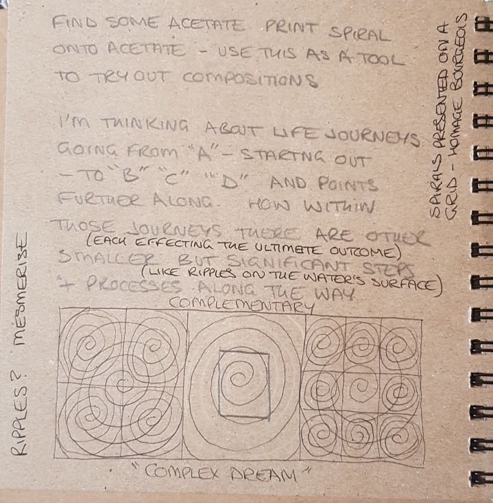
I have enjoyed this process-oriented medium immensely. As a result, I have concentrated more on the process of learning about how best to pull a successful linocut, for example, than I have about development of designs. This is not to say that I have not thought about the development process. There is evidence of this in my sketchbook. It is simply that I have arrived at my desired design outcomes comparatively quickly. As a consequence, drawing has perhaps been my weakest area on this unit. Even though, on both the Drawing Skills and the Intro to Printmaking units, I do use my sketchbook for planning compositions and for recording reference material, it is my intention to further develop my skills of draughtsmanship and composition.
Learning Outcome 2: use a range of printmaking techniques and media
Throughout this unit I have used a wide variety of media and techniques to achieve positive outcomes. Learning much along the way about this highly process-oriented medium, I have gained so much confidence in my ability both to adapt subject matter to suit the medium, and to choose the right medium/method to create a particular effect. This has been true in both my coursework and in side projects, for example discarding one approach to creating a print of a tree with Linocutting techniques for the more detail-friendly intaglio dry point etching technique. Though this technique is not included in this unit, it illustrates my interest in printmaking in general and not just within the parameters of the structure of the unit.
For projects strictly within the course, I have tried to use complementary techniques to best achieve the production of positive outcomes; this has been largely successful. Indeed, I have been pleasantly surprised by the level of enthusiasm with which my work has been received. Sometimes this level of surprise has been quite strong – notably where a highly intuitive approach was required, as in the abstract collagraph. I had low confidence in my outcomes, as this represented new territory in subject matter as well as in method used. But my tutor’s response brushed aside all reservations I had. It is times like these I feel my levels of confidence and self believe really do grow.
Learning Outcomes 3: understand the historical and contemporary contexts that inform your work
As COVID rules begin to loosen up, I am revisiting London haunts such as the Royal Academy and the V & A. I have begun to look at ebook resources on the UCA website instead of relying totally on more general internet resources. I have also reached out to other artists, including Caroline Macey and Paul Catharall to seek advice on the printmaking process.
I have attended the RA exhibitions on Tracey Emin and Edvard Munch, as well as on David Hockney’s latest exhibition. I intend to do more in this vein in the near future. There are indirect historical influences in regards to some of the designs, including church window designs in my personal project, and cubist designs in my reduction print project.

Learning Outcome 4: reflect upon your own learning experience
My ability to reflect upon my work in relation to That of my contemporaries has also improved. This has been due in no small part to my tutor’s responses to my work and to my reflection on my outcomes. Also, her recommendation to read and absorb the Gerda Williams book “How To Write About Contemporary Art”, has been a formative influence. I feel I am beginning to get a grasp of how best to communicate my ideas when writing about my own, as well as other artists’ work. I have learned that in order to communicate more widely and successfully, it is necessary to think about what is relatable on a universal level, rather than simply list the specifics of one’s personal experience. Rather than say “I chose the head of a Buddha for a still life subject due to having been given said item by my brother who found it in a skip one day”, I can speak of my finished outcome being about universal experiences such as “memory” “personal history” or “emotion”. At first, this seemed a little vague, and I admit I’m still trying to get to grips with this concept. But I can see why speaking in universal terms helps others to identify contexts, even though they have walked a different path from me.

Research Point: Corita Kent, Robert Rauschenberg, and Ed Ruscha
Corita Kent
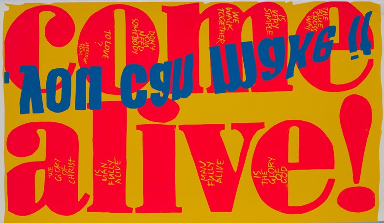
Corita Kent’s prints are reminiscent of fast food packaging. Her work puts me firmly in mind of graphic art used as marketing for fast food and other types of packaging used for everyday items. It is eye catching and seeks to convey a spiritual as well as a social- political message. I was not certain whether these pieces were the result of collage or of printmaking, or a mixture of the two. I feel compelled to emulate the way she has used silk screen methods to create these messages, as she is using popular advertising methods to communicate age old ideas about faith and spirituality. Though my message would be less spiritually inclined, the spirit of spontaneous goodwill these pieces convey is hopefully contagious.
Robert Rauschenberg

Traces of drawing media on paper with label and gilded frame
Defacing another artists work, and calling it art? Hmm, not sure I approve of that. But I suppose that’s the point. As a publicity stunt it’s been rather effective for Robert Rauschenberg, as people are still discussing this subject today.
Ed Ruscha

With its cean, unfussy lines of minimalist architecture this painting conveys so much more than a simple service building. It evokes an era of American popular history. You can almost hear the 1950s car engines as they cruise by, all winged fenders and exaggerated curves. It also speaks of the similar treatment of advertising campaigns at the time. I can almost feel the baked tarmac melting in the sun.
References:
Ed Ruscha: Standard (2021) LACMA. Available at: http://www.lacma.org/art/exhibition/ed-ruscha-standard (Accessed: 5 July 2021).
Erased de Kooning Drawing (2021) SFMOMA. Available at: https://www.sfmoma.org/artwork/98-298/ (Accessed: 5 July 2021).
“The grandmother of socially active art”: the generous work of Sister Corita Kent (2021). Available at: https://www.itsnicethat.com/features/corita-kent-ray-smith-art-international-womens-day-080318 (Accessed: 5 July 2021).
New Acquisition: Printmaking Press
It’s time to splash out on a decent press. I’m in this for the long term, and would like to make some actual money in the process. A professional mindset calls for professional tools. This also involves good planning and preparation in the form of a decent layout to my home studio, aka sitting room.
High on my list of things to do has been a reorganisation of equipment and supplies in my studio, hence a hiatus in printmaking for the last couple of days whilst I set this in motion.
Unfortunately, I failed to remember to take the “before” pictures. Oh, well.


Exciting stuff. The new press will fit into the space, left by the drawers, in the kitchen.
I think that perhaps this printmaking lark is going to take over my life. I’m not fighting it much. It’s a fun process and the medium suits my process-orientated way of working. Good times.
To me, art is the expression of a heightened awareness of the world around us, our relationship with it, and the relationship with oneself. This can take on many forms, from hands-on visceral and tactile drawing onto a physical surface, using sound to vibrate the air around us, or through the medium of code, both digital and analogue. Right here, right now, I choose printmaking as the main process through which I wish to express art.
Update
My new No 2 Gunnings Press from Ironbridge Printmakers

Reflection on Feedback to Assignment 5: Personal Project
My tutor began by congratulating me on completion of this module Introduction to Printmaking. It has been a wonderful journey into this fun and fascinating medium.
She described my approach as both professional and ambitious. This is very gratifying. I also agree with her statement that “with quantity comes quality”.
I need to continue the work on developing ideas in my sketchbook and continue to collect information within its pages. I was also reminded to look at the Cut and Paste exhibition at http://www.nationalgalleries.org, which I shall do.
Task 1 Project 13
Interesting and political juxtaposition of church and amazon packaging, poses the question, “What are we worshipping?” A good use of chine colle, especially the larger scale images of One Click Smile and …And he shall have dominion…
Look at Barbara Kuger’s I Shop Therefore I am
Research Ed Ruscha’s work using text, as well as Rauschenberg and Corita Kent.
Task 2 Project 14
My writing and thinking have become more sophisticated. I feel this is a consequence of reading the section on Artist’s statements in the Gilda Williams’s book How to Write About Contemporary Art – highly recommended by my tutor. I shall look at increasingly sophisticated sources for my research – access UCA ebooks for this.
I need to continue in this vein of challenging my thinking around my work as well as that of contemporary artists.
Look at Art Terms
Wiki for Arts
Glen Ligon – flipping text – look at stencil process
Rejected Works for the Dump

Although I have deemed all of the following unworthy of the storage space required to keep them, my partner pointed out that many, if not all, could legitimately be used at a later date as ideas for prints.


RA Hockney Exhibition: The Arrival of Spring, Normandy, 2020
I’m glad I didnt read the reviews prior to going to see this exhibition of sketches by David Hockney. If you accept the work for what it is – a series of sketches – rather than as finished outcomes in themselves, then it is easier to come away from this exhibition with a feeling of something approaching satisfaction.
Unlike the Tracey Emin/Edvard Munch exhibition, photography was forbidden on this particular occasion. Where the former was light on content but heavy on subject matter, this was quite the opposite. The subject of the emergence of spring in a French garden in 2020 was, for me, an exciting prospect, given Hockney’s reputation for colour use. However, the colour choices made, I felt, were limited by the method/medium used, in this case an iPad. I’d usually see the digital approach as one favoured by graphic artists. But it’s not out of the question to use it as a primary mark-making tool. But, you’d better know how to get the best effects in order to be successful in your outcomes. I’m not sure that David Hockney has in this case. The fact that they are sketches on an ipad that have then been blown up far beyond their original size and placed in such an environment – one associated as representing the upper echelons of the art world, does not improve the effect of these images on the viewer. Rather than working as an enhancement of the reputations of either the Royal Academy or of David Hockney, this exhibition sadly represents a demotion of both. I searched desperately for signs that one of my favourite colour artists had not lost his touch. I was searching in vain.
However, on the train home, we googled reviews of the show. Perhaps unsurprisingly they were pretty scathing. One did mention that they had seen recent, more traditional, evidence of the artist’s drawing skills using pen and ink. It was with a heart warming feeling, and no small sense of relief, to learn that his talent is still very much alive and kicking.
References:
David Hockney: The Arrival of Spring, Normandy, 2020 | Exhibition | Royal Academy of Arts (23rd May – 26th September). Available at: https://www.royalacademy.org.uk/exhibition/david-hockney (Accessed: 30 June 2021).
Personal Project: Part 5: Chine Collé: Artist’s Statement

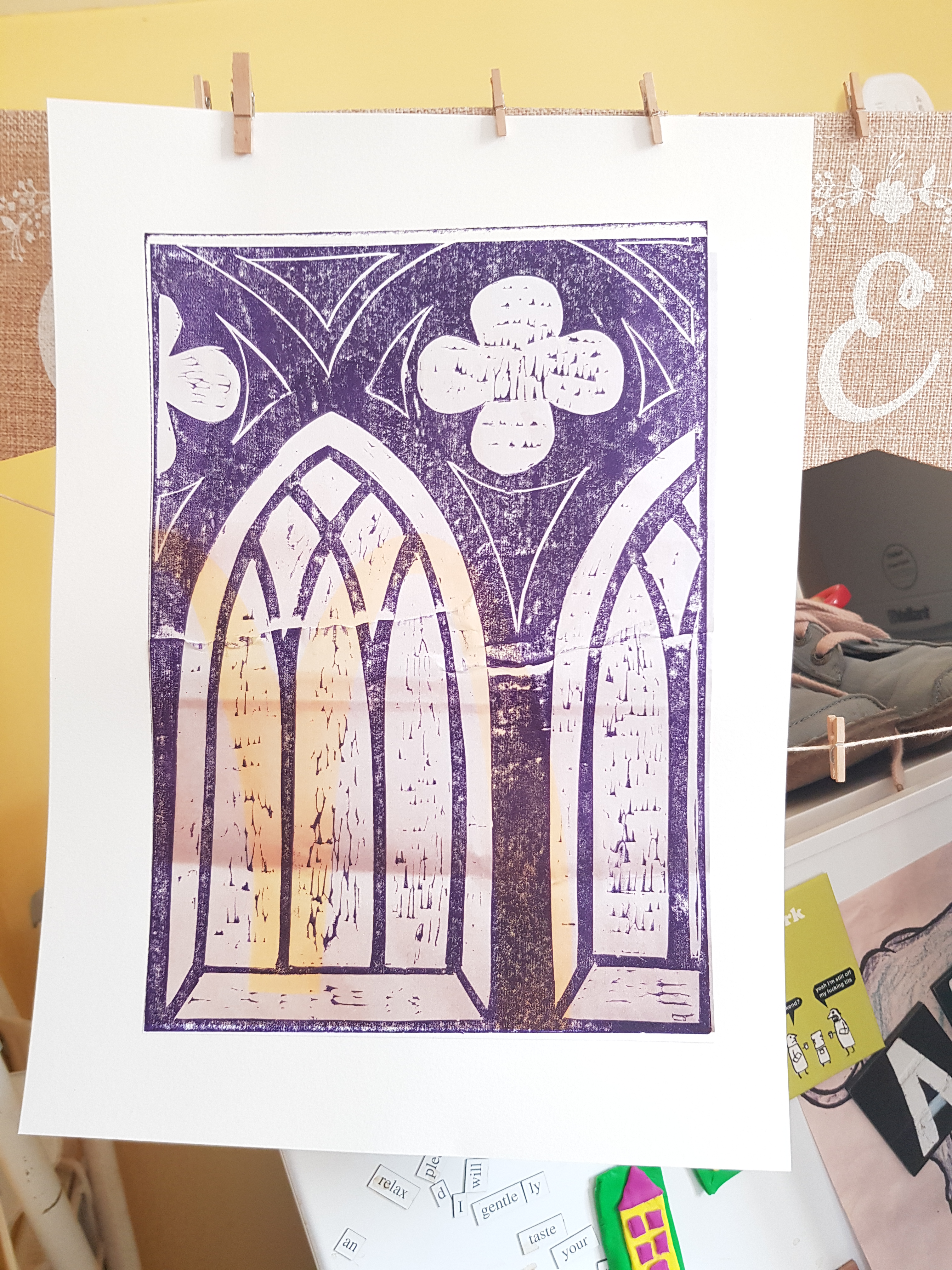
Inspired by Diane Croft’s prints of landscapes, I contemplated the growing pile of discarded delivery packaging in my studio, and decided to put the two together for this personal project, using the chine collé technique. A stained-glass effect in Croft’s depiction of trees caught my eye, leading me to use the image of a church window to symbolise an historical element in this print series.

I have set out to say something about the gradual erosion, over millennia, of a sense of personal responsibility around the sourcing of food, particularly meat and meat products. From the time we were hunter-gatherers and presumably had respect for the ebb and flow of supply, until now, when we have merely to ask Alexa, and 30 mins later it is served up at the door on a bed of pizza dough or within a burger bun, what has happened? Our brains and bodies haven’t evolved particularly, but we have moved into a technological age. This technology was developed with the best of intentions: to serve a purpose; to aid humanity.

This subject is highly personal to me, as it is about food and online ordering. It would not be overstating things to say I have addiction issues. Middle of the night binge-eating and secret solo shopping trips, each internet-reliant, are not unusual. And I know I am not alone in being alone.
The beaming Amazon packaging of “One Click Smile” is juxtaposed with a chine collé linocut print in the shape of a set of church windows. Through these windows can be seen two hearts. Green with envy, they implore us to “Choose me, use me, recycle me.” It’s as though this is a church mantra, a hymn for our time. We have allowed ourselves to become hypnotised by advertising in the same way we once accepted the rule (and rules) of religion. Formerly people were under-educated; now we suffer overwhelming information overload. It’s hard to filter it out; to focus on what actually matters.
I seek to comment on the fact that we are divorced from our natural environment. Addiction to mobile technology and online activities have replaced community and any genuine connection. We crave yet more of the same damaging habits, thus proving one of the best-known definitions of madness. Something has to give.
References:
Linocuts (no date) DIANA CROFT. Available at: https://www.dianacroftart.com/linocuts.html (Accessed: 18 June 2021).
Reflection on Tutor Feedback to Assignment 4: Abstraction in Collagraph Prints

I’m pleasantly surprised to find that, once again, my work has been, not only acceptable, but greatly appreciated by my tutor. This is due in no small part to the scale I have chosen. The test pieces were roughly A1 in size. I find it more satisfying to use a broader “canvas”. It at least gives more scope for space between objects, as well as for the objects themselves.

The image above was one my tutor particularly liked. She thought the spacing and arrangement of the component parts of the plate were in keeping with aesthetic value of this collagraph print method, in that the “less is more” principle has been adhered to. This was a tip she imparted at the end of the previous feedback tutorial. It is one which I kept in mind, as the temptation is to keep on sticking bits onto the plate ad infinitum.
Again, I need to draw more from life. But what I do put into my sketchbooks has been reflective on the processes I’ve employed, which is useful. However, I could say more about the “whys” as well as the “how”. This unpacking of the reasons I’ve made certain choices along the way will be useful for communicating ideas in other areas. It’s a new language for me, this art speak.
The next part of the module is “Chine Collé Personal Project. My tutor’s tip this time is to use decorative papers that are appropriate, or somehow complementary to, the subject matter chosen – not purely to make it look pretty – but because it adds to the subject in some way, or highlights a message I am attempting to convey.
Action points:
- Look at Guardian art reviews and learn from language used to discuss artwork
- Maintain drawing/sketchbook practice
- Be Reflective on the “whys” of the work as well as the “hows” of the process
- Be more self critical and evaluative
Part 5: Personal Project


Hopefully the Macdonald’s reference here is not excessive. I wanted it to look like a stained glass effect. There should be a realisation that it’s not a church at all but possibly an ad for a fast food restaurant. I’m suggesting that one has conveniently filled the void the other has left. Or indeed, it has barged it rudely out of the way.
I used a lot of paper today, possibly unnecessarily. The following are the also-rans of today’s work: