Better late than never. It’s been a month or so since I received formative feedback on assignment 2. The main matters arising were as follows:
Matters Arising from (in no particular order) Introduction to Linocut
1)Transfer Blog to OCA Spaces for reasons of ease of navigation.
Although I initially agreed that this was a good idea, I realised that in order to do so I would need to use my OCA email address to link the content of my blog when thus transferring it. As I shall ultimately lose my email address at the end of my studies, I decided to remain with WordPress as it means I get to keep all of my work online.
2) Draw more often from source
This I have tried to do using objects that are around me such as cars and people in the park.
3) Do more research posts and make them overt so that they can be easily found on the blog.
This has been started, in that I have added the relevant category “Formative Feedback” and “Reflection on Formative Feedback”. I am finishing this task once this particular reflection piece has been completed.
4) Michelle was genuinely pleased and impressed by the quality and the quantity of Printmaking in evidence in my portfolio.
She gave me pointers on artists such as Edward Hopper, Vanessa Gardiner and Martin Lewis. She recommended mind mapping my decision making process on which life form to pursue during the following Part of the unit.
My next assignment is due 16th April 2021.
Summative Assessment will take place as intended in November 2021.
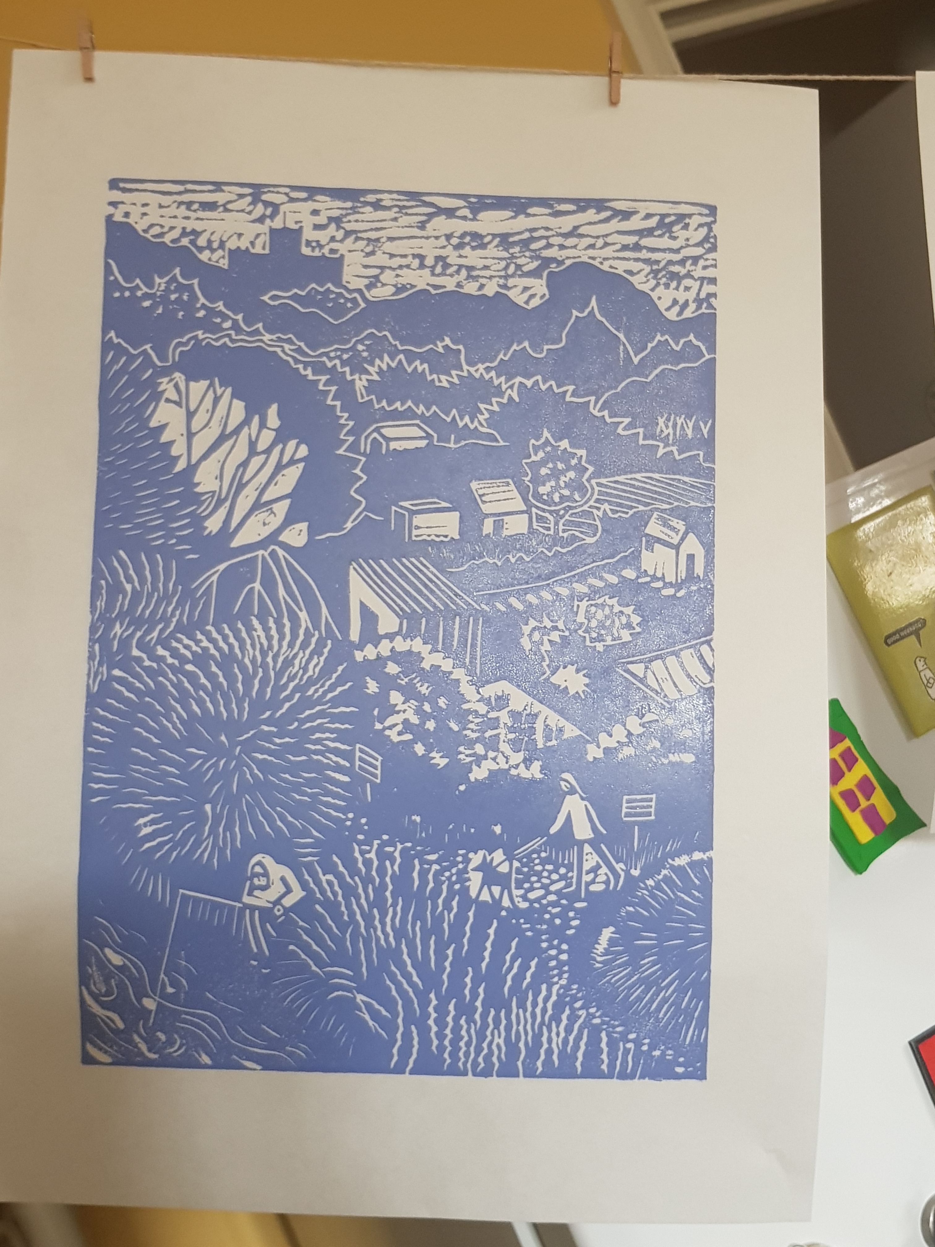
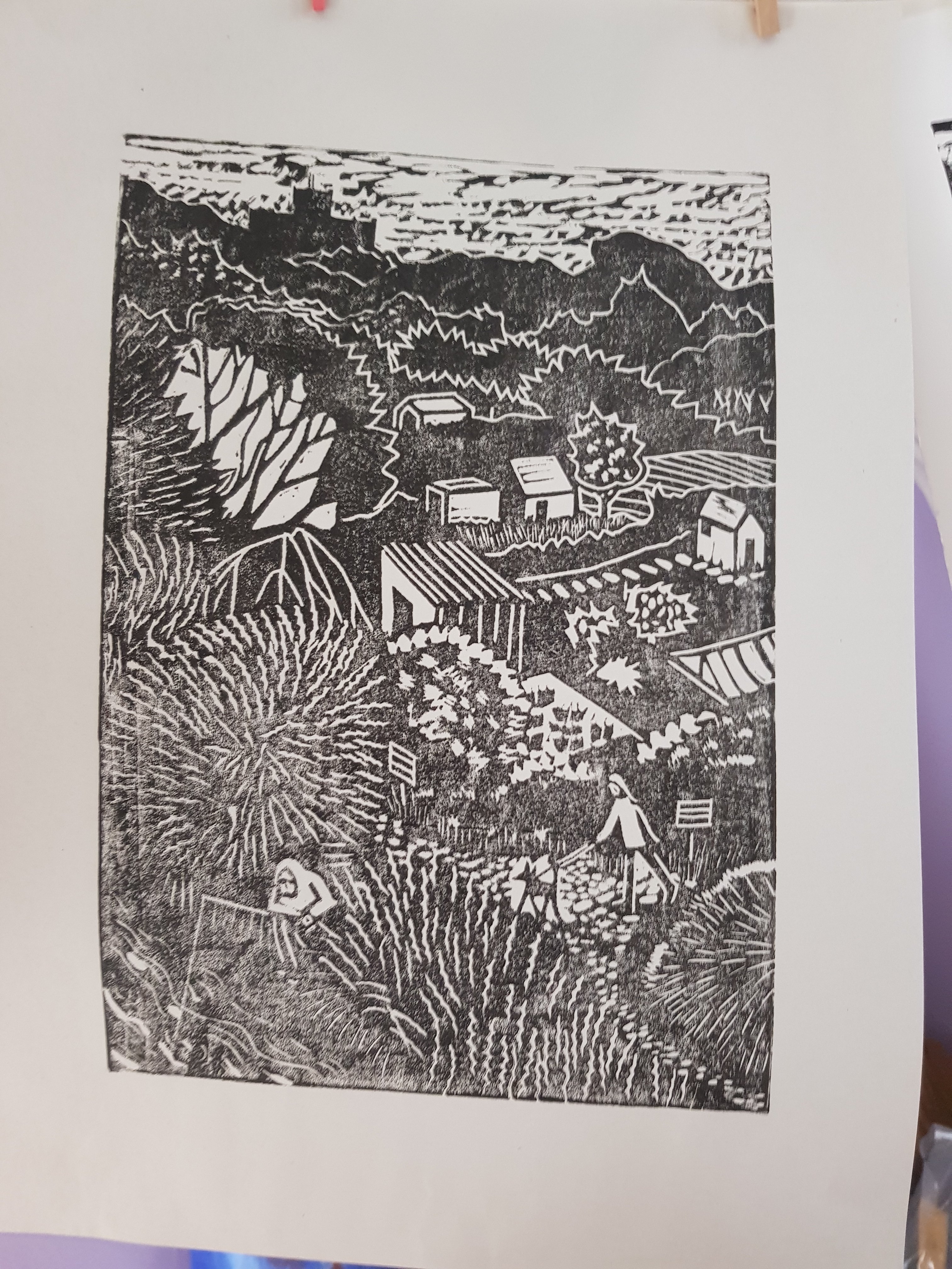
I feel that the above image conveys my intention to represent the feeling of isolation we are all experiencing right now due to COVID restrictions. Even my mistake of cutting in the wrong direction on the 4th lino plate has had the effect of an overgrown area around the tiled floor behind the benches. This hints at a gradual deterioration of environment. I had felt the need to create a 4th plate in order to lend definition to the benches, which had been lacking in previous prints using plates 1-3.
Lino plate #4
I used the following image as a starting point for this scene, it is a lonely spot at the best of times. But out-of-season during COVID appears to be so desolate a place. I was very pleased to have noticed this spot and captured it from this particular angle.
Original inspiration taken between lockdowns 2020My artistic impression sketch
I was inspired by the minimalism of artists such as Paul Catherall with his prints of recognizable buildings such as Tate Modern, for example. I feel that his ability to simplify images down to their essential components holds the key to creating impactful outcomes. I feel I could have benefitted from working my “Bottle Alley” print on a larger scale. The effect of multiple layers has tended to confuse the image (A5) at these dimensions.
I shall be submitting the following for task 3 of Assignment 2. These prints for Project 7 were concluded over the weekend, ever mindful of my self-imposed deadline of this wednesday to submit, or at least to post my portfolio.
Print from plate #1Print from plate #2Print from plate #3Print from plate #4
I have not made a print using all 4 plates as this would be confusing and lacking in contrast and therefore reducing impact. Instead I have included the following:
Plates #1 plus #3Plates #1, #2, and #3Plates #1, #2, and #4Plates #1, and #4 (slightly offset) on Somerset satin white Printmaking paperPlates #1, and #3
Most of the above prints were created with oil based ink on Hosho paper and were hand- burnished using a cheap plastic baren from a speedball kit. I have found this to be the best method for pressing, so far at least. Registration was achieved using a purpose – built jig.
This project has been an enjoyable challenge, if a bit tricky due to my inexperience and my choice of scale. I chose this due to the plates I had that were multiples of exactly the same size. I did not wish to mess about cutting down larger lino pieces and risk having them be misaligned due to inaccurate trimming etc.
I intend to go on to the next part of the Printmaking module having learned much of use from this exercise.
I’m starting to get decent consistent prints from this plate now. This is from using Japanese Hosho paper, oil based ink and by hand-burnishing only. The following prints will be submitted for Task 2, Assignment 2.
Japanese Hosho paper with gradations to the ink from green to yellowOil based ink on Hosho paperJapanese Hosho paper
I tried adding gradations to the colour in the green print on Hosho paper. I think it’s quite effective, as though the sunlight is touching areas and leaving others in shade.
I feel that this piece, though initially inspired by a scene created by Jane Dignum “Poppies on the Allotment”, has more to do with the dictates of the governing state, as symbolised by an historical monument – St Albans Abbey – and how people’s lives, whether in their best interests or otherwise, have been and remain controlled from the top down. The eye travels down from this monument through the suggested toil of the land to individuals themselves as they go about precious leisure time. These people are essential elements of a scene to lend life as well as scale. They are also rendered almost insignificant by the vast wealth and magnitude of the institutions that govern them from afar.
In short, hopefully I have managed to express my feelings about the status quo under the guise of a simple image representing our much loved green and pleasant land.
After applying this second layer in blue, I have come to the conclusion that I need to remove the textured area of sky on plate #1 as well as having removed it from plate #3, which is the next (and last) layer to be printed.
This is how the #1 plate prints before further cutting:
And after cutting out the sky area completely:
Sky area cut out
I have produced 4 from this version in yellow. I shall leave plate #2 as it is with some texture in the sky so that it is not left completely blank in the final outcome.
All of the above were printed on Japanese Hosho paper using oil based ink.
It occurs to me that the Printmaking module is a totally different kettle of fish to the first Drawing module. This is because, unlike printmaking, artists enjoy a good amount of direct control over a pencil, scalpel blade, or whatever their tool of choice.
With printmaking there is more than ones self assurance (or lack of) to get in the way of the artist and their aim at creating a positive outcome. There is always that unknown element. How the Printmaker is going to feel, after that “moment of magic” when the paper peels away from the plate, is unpredictable. More sudden than a post – 200g “death by chocolate” drop in blood sugar, but can be just as effective to ones mood.
I began the day by cutting out the sky area from Plate #3. I feel this has more impact upon the expression of isolation inherent in this lonely scene.
I had considered leaving a gull-shaped area in the sky. I tested this out on the original design and decided that the addition of a lifeform to the scene would decrease its sense of loneliness. I was keen to express a sense of isolation in this design, and did not wish to risk it becoming too cheerful.
The above is using plate #3, therefore the last layer of ink on the image. I have prepared several print layers using plate #1 as illustrated below:
Using Zerkall 120gsm paperUsing Japanese Hosho paperUsing Japanese Hosho paper
Comparing the first image with those using Hosho paper, the difference in print quality is remarkable. I am officially a Hosho paper enthusiast.
Also, I took a stab at Abbey View:
Unfortunate ink splodges on the border here
The edges of the print on Hosho paper are so much sharper than before. I should add that I am now using a decent student quality brayer for inking my plates.
For the yellow and green images I shall likely use purple ink for the #2 plate layer. I have also printed from plate #1 using strawberry icecream pink as follows:
Pink oil based ink on Hosho paper
I think purple or slate blue – a cool colour – on top of pink maybe effective.
The next stage using plate #2 will have to wait 48 hours for the ink to at least be touch dry.
The last time I blogged about Project 7, I was optimistic in anticipation of embarking upon the design for “Bottle Alley “. Today’s work has seen some major turns of fortune. I have all but reached the conclusion that I may have chosen the wrong image for a multi-block print. This is due to the fact that the above image has more impact as a monochrome piece than its predecessor, “Abbey View”, which lacks sufficient contrast and could benefit from a few gradations to accentuate depth of field.
However, I am determined to complete this Part 2 of the module by my self-imposed deadline of the 24th Feb, so shall persevere with my initial thinking and make the above design for “Bottle Alley” work as a milti-block print.
I began the day by cutting further into the first lino block on which I had hand drawn the design for “Bottle Alley”. Before doing so, I had transferred the image by means of printing, first onto paper and then by pressing this printed design onto 3 lino plates in turn – all the same size: aprox A6.
Top: Block #1. Bottom: Block #2
The first block to be printed from (#1) would cover more area in a paler colour (yellow). This Block #1 was cut and inked using yellow oil based ink and printed into Zerkall 120gsm Printmaking paper. I put this aside and, after cleaning up, set about cutting Block #2. I then printed over the yellow layer in red using Block #2, as follows:
Colour is a bit too intense
The above image, though a bit intense, serves to illustrate that I have a design worthy of pursuing. In the final image, I feel it would benefit from a much more subtle palette.
I cut into the 3rd, and as I decided, final lino Block #3. The plate size is too small to hold more than three colours without confusing the design and diminishing the impact. I therefore ended up with a spare lino plate- designed, but as yet uncut.
The areas which I had intended to be white have been left with some interesting texture in the yellow and red of Blocks #1 and #2. However, this effect is entirely overshadowed once printed with the blue ink from Block #3.
Bit confused
I am done for today, but shall return to my studio tomorrow to rectify the above confusion of texture and overlapping colour. Though it does have something of an “apocalyptic chic” about it, I feel it needs at least a little pruning.
By the way, I have neglected to mention that I have constructed a jig (as outlined in course text) for the purpose of aligning blocks for well-registered prints. I look forward to using this in the next few days.
Continuing on from yesterday’s attempts at producing a nice uniformly inked print, I began by taking a control print from an old linocut I found lying around in my studio:
Old Mermaid linocut
The resulting image was (somewhat inconveniently) pretty good. This could be due to it being considerably smaller than the A4 sized plate for Abbey View, and also having received more focussed pressure from the jack press as a result.
Control Print before lightly sanding down the surface
I have decided, in response to a suggestion, that a little light sanding of the lino may help to hold the ink on the surface. I did so, sanding the area from the top if the mermaid’s hips where the scales began
Left: initial control print. Right: lightly sanded from the hips down
As you can probably see, the second print (on the right hand side) is no better, perhaps even slightly worse, than the control print. Sanding the lino has made no difference whatsoever to the print quality.
By this point my spirits were tumbling downward. It was time to accept some practical assistance. This came in the form of my partner, putting his life on the line by offering to watch my process and make useful suggestions. Though this was a seriously risky move on his part, I soon acquiesced. He pointed out that, for him, it was a no-win situation. His methods could improved things, or it make them worse. Either way, I would likely be irritated by the outcome. Unless, of course, there was no change at all.
Nevertheless together we persevered.
It did not take long before we had diverged from my previous custom of using what I had thought to be sufficient ink, but which my partner pronounced as “simply not enough”.
I followed his suggestion to add more to the rolling plate and apply another generous coat.
Left, my most uniform print from yesterday. Right, (somewhat irritatingly) after helpful assistance from my partner
The difference between these two prints is remarkable. The series of layers placed on top of the wooden platten to produce the right hand print was as follows: Double inked plate, paper, blank plate, wood, extra pressure from jack press.
The next print (below) I hand-pressed using a plastic Speedball baren with more ink on the plate than I had been using up until today.
Hand pressed using Speedball baren and extra ink on the plate
Even this is better than I had been producing previously using my jack press. But, due to the noticeable grainy effect of the ink on Zerkall 120gsm Printmaking Paper, I think I can do better still.
I tried using a different paper stock, Fabriano 250gsm UNICA Printmaking Paper. But, as was suspected, it produced speckly results due to its textured surface.
250gsm Fabriano Printmaking Paper
It does at least still produce a consistent result despite being speckled.
Conclusion: I am beginning to appreciate the many and varied factors that go into the production of a decent print. Ink consistency and quality, paper weight and texture, hand or machine pressed, and with or without padding on the platten.
I shall persevere with my tests and shall hopefully go on to produce consistently reliable linocuts. However, I shall now move on to Project 7 – Multi-colour linocuts, putting into practice what I have learned so far about all the different factors involved. It is possible that a smoother paper may have better results.
Update:
I have since discovered the merits of Japanese paper, specifically Hosho printmaking paper. It is very kind to the removal of ink from the linocut.
Although I have yet to complete on Project 6, “Abbey View”, I thought I’d make good use of the time available to me before the sunrise. Hopefully that’s not too nauseatingly enthusuastic of me.
I like the loneliness of this image. I considered the addition of a gull to add a bit of life to the scene. But I’ve decided to leave it as a stark representation of the sense of isolation we feel during COVID times. The scene of an abandoned beach – which would usually have at least a few dog walkers in evidence, even in winter – puts me in mind of how this pandemic affects everyone, no matter where we live.
I have set about my design for “Bottle Alley” based on an image I captured in a drawing, as well as a photograph, in late 2020.
The above was taken this morning after seeking/receiving advice from Jim Westergard about speckled and patchy prints. This time I placed blotting paper between the felt blanket I was using to cushion the paper between the plate and the first wooden slab on my jack press. So, there was the plate placed face up on the platten. The Printmaking paper on top of that, then several pieces of blotting paper and then the blanket followed by the wooden slab and pressure supplied in the form of a car jack.
I feel there is slight improvement. There is a more consistent spread of the ink. However, I think I could make a better print if I were to gently sand the surface of the lino. I vaguely remember being advised this before, however a simultaneous email sent to the Printmaker and Illustrator Paul Catherall brought this back to mind.
In an ideal world I would have taken this crucial step prior to cutting my design, but lessons learned the hard way are more easily recalled I find. I shall need to take care to remove dust and debris from the cuts and the plate surface before attempting another proof. Also, the ink is very cold and I neglected to warm it through before taking this morning’s proof. I am attending to this now, and shall edit this post accordingly once this and further steps have been taken.
I shall likely test out the late light sanding step on an old attempt at lino cutting I carried out before starting the course.
Early linocut attempt
This produced the following proof following the same procedure with the blotting paper padding as before.