Update: Project 12

I’ve been waiting on paper stock supplies so that I can print from my latest collagraph plates. Having made them a bit too large for my current paper stock, I ordered further heavy weight paper from Jackson’s. This has turned up today. So tomorrow, bright and early, I shall recommence proceedings.

The following plates are what I came up with in response to the abstract brief for Part 4 of Introduction to Printmaking. My initial intention to work with the themes optimism, movement, balance, and flow have morphed into those themes surrounding COVID rules and how we have responded to them. Instead, I have created plates entitled, “community”, “containment”, “control” and “contamination”.

Craft lolly sticks, bubble wrap and O rings

The above was developed from the sketch below on the facing page of my sketchbook.

My thinking behind this was about the organic nature of society and community. I likened it to the petals on a rose, only a bit more rigid in nature. The sticks are arranged sympathetically with one another to form a structure that is supportive, but also adaptable. The next plate was an attempt to create an image that depicts how it feels when patriarchal societies seek to exert control over the population.

“Control” plate with corrugated packaging and metal washers

I arranged the the above plate without prior need of sketches, as I had quite a clear idea in my mind of what effect I wished to achieve. I was pleased with the outcome below.

“Control” Print on damp 250gsm Fabriano UNICA printmaking paper 28cm x 38cm

The enforced rigidity of the movement of the circular motifs in this print call to my mind a metaphor for limited freedoms during COVID-19 and its various strains. Whereas, the following print taken from the plate for “Containment” is less rigid in structure. It appears to exist via faith alone, as its building blocks do not adhere to the more solid rules in the print called “Control”.

Containment

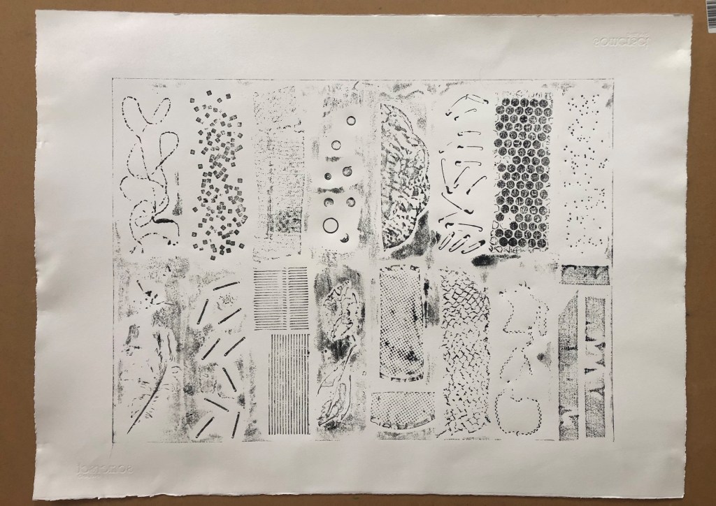
The next two images are plates at various stages of completion. I need to take prints from these to determine what to add or to subtract from them to depict “Contamination” and “Community”

“Contamination”

The above plate was inspired by the following doodle which I scrawled onto my iPad, printed off, then added to using biro and highlighter pens.

Sketchbook doodles inspiration for “Contamination”

The above sketch was in turn prompted from looking at images of the Delaunay bisected concentric circles with their rich colour juxtapositions. I shall enjoy playing around with my own colour choices now that my paper has turned up.

The following is another plate – a version depicting “Connection”. Here, I have used string to form the double spiral and metal washers to ‘populate’ them. The external negative space has been textured using poly filler and sand, and by pressing corrugated card into the surface whilst not yet set to give the surface small ridges.

“Connection”
“Connection” printed on damp Somerset satin 300gsm printmaking paper

There is an inadvertent smiley face in this image. Appropriate or not, it is clearly visible. Perhaps re orientating it to landscape would eliminate this unfortunate effect:

The following is entitled “Contamination” to continue with the theme of how the pandemic has affected social cohesion. There is something about the way the spiral holds both the occupants and contaminants equally within its organic structure.

Collagraph plate for “Contamination”
“Contamination” print on Somerset satin 300gsm printmaking paper

References:

Tate (no date) The EY Exhibition: Sonia Delaunay – Exhibition at Tate Modern, Tate. Available at: https://www.tate.org.uk/whats-on/tate-modern/exhibition/sonia-delaunay (Accessed: 14 May 2021).

Part 4: Project 12: Abstract Collagraph

(Task 12)

The best (if not the only) way I can view, and try to understand non-representational art is to think of it as analogous to something else.

I attended half an online taster session in Art Therapy at the University of Hertfordshire a few months back. We were instructed to close our eyes and, with a pencil, try to locate the edge of a piece of A4 paper without going so far as to allow the point of the pencil to wander off the edge of the paper, and mark the surface of the table. Other people drew lines around where they perceived the edge of the paper to be, as though pacing a cell and surreptitiously checking for weak points . I attacked this imaginary boundary. When I was done, and opened my eyes, I saw an elongated, jagged edged shape on the landscape sheet of coloured paper. I interpreted this to mean that I was like some kind of rabid beast, hell-bent on escape from – exactly where?

The reason I recount this now is because I feel it illustrates my view of non-representational art. It’s like painting a tiger with your hands tied behind your back. (You can’t paint with your feet because you’re busy using them to run from the tiger!)

Flights of fancy aside, I do find abstract art interesting, if a little perplexing. So it is with some trepidation and with a spirit of adventure that I embark upon this latest project.

Part 4: Project 11: Collagraph Test Prints

A1 test plate – prior to inking (Flipped then annotated)

So keen was I to take prints from my test plate, that I neglected to look at the directions in the course text. I went ahead and inked my plate using some scrunched fabric. Without dampening the paper, I took two impressions.

The resulting prints were a little as though a spider had wandered across the paper with dirty feet. However, I have, at least, learned that certain materials work more effectively than others.  Not dampening the paper prior to printmaking led to weaker results, but it did at least tell me which materials were most impactful.

The following is the initial print onto dry smooth Zerkall 120gsm printmaking paper. I like this print. At least all items made some impression. The best effects came from the corrugated card, the bubblewrap and the mosaic tiles. I’m excited to move onto developing another plate – this time using a smaller piece of mountboard as the only paper I have that’s heavy enough to take dampening is my Somerset paper, which I have only in smaller pieces than the Zerkall seen below (54cm x 76cm).

Initial print

I think, with the next plate, I shall attempt a more interesting and cohesive composition, rather than redoing the test plate exercise. I intend to continue with the themes of optimism, movement, balance and flow.

Update:

The following day – feeling optimistic- I set out to rectify yesterday’s error and dampen the paper before printing. This was overly ambitious in scale as the Zerkall paper I have is not quite as robust as Somerset, for example. Therefore it buckled somewhat under it’s own sodden weight. However, I took two prints regardless, as follows.:

Print on damp Zerkall 120gsm with black oil based ink rolled onto the plate
Print onto damp Zerkall 120gsm – black oil based ink pressed onto the plate

I’ll wait for the ink to dry before attempting to flatten the paper under some blotting paper and some form of weight.

Update (May 2021)

Test print on 56cm x 76cm Somerset 300gsm satin printmaking paper – soaked for 10 mins then blotted before printing

The above print is a lot clearer than former attempts using lighter weight paper – either dry or damp. I feel that the most successful items used here are the bubble wrap, mosaic tiles, beads, and corrugated card. I shall use these in further print plates for Project 12, the abstract composition.