Formative Feedback on Assignment 1

  • I was hugely relieved to receive largely positive feedback on my first assignment for the Printmaking Module Part 1. Pleasantly surprised to have my Printmaking submission described as “exciting work”, I am motivated to move on with the next part of this module relating to linocut.
  • The critical feedback I received was useful in that my tutor has provided me with tools to develop my personal voice. She suggested I use mind mapping methods to brain dump my thinking around the reasoning behind the “Why” I chose certain objects. This should be by using universal language, rather than simply telling about the specifics of how those objects came into my possession. She said to ask myself pertinent questions about how I feel the work (both my own and historical/contemporary artists) could/will be interpreted by the viewer.
  • Again, I need to use this personal voice to communicate an intent at the outset in making decisions about the technicalities of the work, and the research underpinning it. Also, during production reflect upon how I feel about the printmaking outcomes as they emerge – that moment of magic. (I could also record mistakes and happenstance)
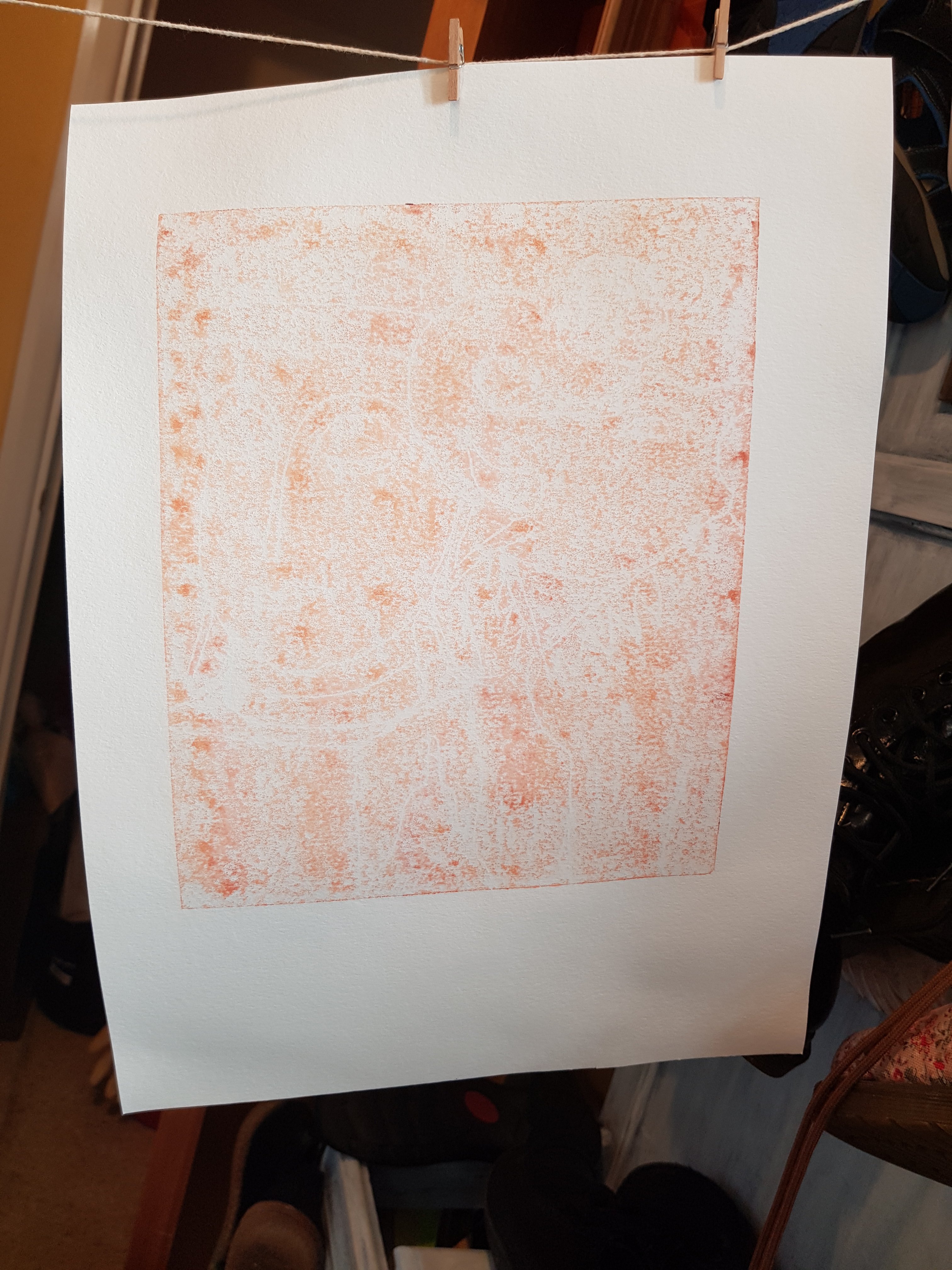
  • My tutor also mentioned paper stock (together with a link to a supplier of Zerkall 120gsm paper). She added that my use of cheap A3 photocopier paper was limiting the effects of the oil based ink I was using, which had led to an unwelcome blotchy effect on some prints.
  • Rather than listing the specifics of how I find objects, I could be describing what the assembled objects are about. Talk about the themes behind the work, whether it be family/memory/emotion/relationships in form, colour or texture etc. Does the work pose a question to the viewer, or seek to make a statement in some way?
  • I also need to do some wordpress blog admin – a dedicated space on my website menu – for recording/navigating Reflection on Formative Feedback as well as for the purposes of Research blog posts.
  • My tutor also said that the project 4 prints were by far the best in this submission, that I had saved the best until last.
  • I should continue to use my sketchbook to record daily observation in sketches and notes etc.

Mind map the following:

The personal – specifics surrounding reasons for choosing a specific object or collection

the universal – how it may be viewed

the underpinning research – contextual studies

Technicality – paper, method/quality of inking, press, plate, spacing etc

Part 1: Assignment 1

To sum up my experience of monoprinting, if I’d had more fun with it, rather than cursing my lack of a perfect print, then this part of the printmaking module may have produced more positive outcomes.

For Project 1, I am submitting the following prints:

The “least bad” prints Project 1

These were produced by painting ink onto either a glass plate or one of copper. Clockwise from top left, these are printed on cartridge paper, newsprint, 120gsm Zerkal and basic A3 photocopier paper. The objects include a birthday gift of a sculpture from my sister, as well as the head of the Buddha – a rare gift from my younger brother – who found it in a skip on his way over to visit one day years ago. These objects have some degree of emotional attachment for me. Generally speaking, objects don’t hold emotional value for me particularly, though I do possess a lot of interesting objects in my flat. The pear is an ornament I picked up when out charity shopping with my partner, an example of a fun activity which we were once able to do freely.

For Project 2, I offer the following outcomes:

Project 2 Positive and negative masked monoprints

These are printed on white A3 photocopier paper, and on 140gsm black paper. From top left going clockwise they consist of a simple positive print from a negative mask (albeit white ink on black paper, just to confuse the issue), followed by a rare spotless positive print in yellow oil based ink on white paper. The next one is based on a sketch of the head of the Buddha and is a positive print from using a negative mask (again, somewhat confused by printing white on black). Finally, bottom left shows a negative print using a positive mask where the f holes in the violin have been cut out to show that extra detail.

The initial sketch of a violin was inspired by an instrument I have been practising for 3 years now. I am just starting to make actual music. The shape is particularly well suited for this exercise as it is so easily recognisable.

Project 3 Two coloured masked monoprints

For Project 3, I developed layers of positive and negative prints. Here I used bubble wrap to give texture to the background of the violin (bottom left). I was not entirely successful in registration of positive and negative prints in my outcomes, but I feel the effects are good enough to submit due to the colour combinations I have chosen to use. All of the above are printed on A3 photocopier paper using oil based ink. The print top left is my attempt at a landscape. Here I have used a brush to paint onto the plate as well as back drawing the clouds, thatched roof, and ploughed field.

There was a delay in awaiting a fresh order of supplies. I had a set which should have included oil based yellow ink, but in fact had 2 x black tubes instead. This was somewhat frustrating as I had to wait for my order to be delivered. But I am very pleased with the quality of the ink from Jackson’s. Needless to say that, in future I shall not be buying little sets on Amazon.

Finally, I am still working on Project 4. Please see previous blog post for the story so far. I shall update in due course, ever mindful that it needs to finished and dry for posting tomorrow (Thursday 14th Jan ’21) before noon.

Update:

This morning I have spent time attempting to finish Project 4 of Part 1, however the outcomes were not as good as I’d hoped. Rather than ask for another extension on this first assignment, which would be very last minute and not really on having already spent 3 months dithering I’m going to send what I have regardless.

Project 4:

On reflection:

Although not ideal, I feel that to get a perfect, or near perfect, outcome with the monoprinting method is a tall order. I could spend six months on this and still not come up with anything I’m really happy with.

I am looking forward to the next part of this module where we are lino printing. Hopefully I will have the opportunity to put what I have learned so far into action in Part 2. I will not abandon monoprinting entirely, especially if my tutor directs me to rework my assignment. But it has been a largely frustrating experience. I’ll be pleased when I can move on.

Part 1: Project 4

For the last couple of days I’ve been playing with this design. I started with the following poorly defined ghost prints using leftover ink straight from backdrawn plates:

I then used a mask of the Buddha and the elephant to give some definition to the background in ultramarine blue:

Then, after they had dried sufficiently, I added a backdrawn outline using yellow mixed with a tad of ultramarine blue oil based ink:

I’m hesitant to add more layers to these as I risk spoiling them. But I think they could benefit from “sweetening up” using a bit of pink or lavender colour. It would help to bring out the green.

I’m running out of time. This first assignment is due to be posted on Thursday (day after tomorrow!) Though I can’t risk spoiling it, I can’t really send them as is either. Perhaps I shall test out my theory on the weakest version first to see what occurs.

Thinking about it, I feel I could have enjoyed this Part 1 of Printmaking 1 more if I’d been less precious about trying to get a perfect print. I intend to enjoy Part 2 more as it involves linocut, which is far less hit and miss than monoprinting. I’ve just placed an order for some assorted A3 coloured paper. I may do more experiments with monoprinting using these in conjunction with (or at least alongside) working through Part 2.

Part 1: Project 4: Textured and Combination Monoprints

Today’s Printmaking session started off a bit rubbish, but went on to improve somewhat. I seem to be relearning what I’ve already learned – remembering to leave plenty white space, for example – as initially today’s prints were ill-defined at best.

In the above prints I returned to the technique of brushing the ink onto the plate (glass) but this time I used dampened paper to get as much of the ink as possible from the plate and onto the paper. Here I have used smooth Zerkal 120gsm paper and a textured Fabriano paper 250gsm.

I decided that the black background was far too heavy and opted for the lighter terracotta colour instead. But here I wish I’d left some white areas on the elephant so that it could be more easily recognized as such, rather than a peanut butter coloured splodge.

I had a break and returned, determined to pull something of value out of the morning’s work. The following prints were done on A3 photocopier paper. My intention was to produce masks from photocopies of my initial sketch:

These copies I placed onto the back of the A3 copier paper as it sat on the lightly ink rolled plate and I have then drawn onto the photocopy to produce backdrawn outlines of the design:

These I intend to build upon using layers and by masking areas using cutouts from the photocopies of my sketch.

Manyana.

Update

Finally product a reletively clean print with no spots

I’ve spent the past couple of weeks attempting to build up print layers on multiple prints of the same image of a violin – apart from a slight deviation to play with the face of the Buddha which, as it’s a negative mask using white ink, is only really effective on black or coloured paper).

It has been a frustrating time as I’ve tried to perfect a spot free image each time. I used A3 photocopier paper as it was plentiful – having bought it at a car boot sale at a greatly reduced price. I had begun this part of the Printmaking Unit thinking to vary my paper more widely, as is suggested in the course text. However, I have had such patchy results that I abandoned this approach in Part 1 Project 1.

Patchy results

Yesterday I returned to part 1 and, using oil based ink, I was able to achieve the following images by first dampening the paper (Zerkal and cartridge) by soaking it for 10 minutes or so before printing on it. I had thought that this method would only be necessary for producing intaglio prints. I feel it’s useful for Monoprinting too if you are using oil based ink. If I had still been using water based ink, this would have been inadvisable, of course.

Ghost monoprint using oil based ink on dampened Zerkal Printmaking paper
Monoprint using oil based ink on dampened cartridge paper
Monoprint using oil based ink on dampened Zerkal Printmaking paper
Ghost monoprint using oil based ink on dampened cartridge paper

In the past week I gradually accumulated enough prints on which to experiment with second and third layers, allowing for “wastage” of those that may not make the grade.

Part 1 Project 2: Positive and negative masked monoprints
Part 1 Project 3: Two-coloured masked monoprints

Today I built up a third layer onto some of these prints in an attempt to create interesting textured effects

Above are a mix of monoprints using oil based ink on A3 photocopier paper. Methods include back drawing, the use of masks and bubble wrap to form impressions onto the inked plate before taking a print.

Tomorrow I shall do more of the same, using different colours and different objects for added texture.

Part 1: Project 3: Multi-layer Monoprints

I set out today to add texture to yesterday’s prints using white ink. It then occurred to me that I could print using white ink onto other coloured paper, as well as black paper, and aged sheet music.

Firstly, I thought it was time to cut out a new violin mask (as well as design a new mask, using a different personal object, to use in conjunction with, as well as seperately to, the violin mask).

Forgot to cut “f” holes

I particularly like the white ink on black paper. The ghost print beside it unfortunately included a couple of spots. I may use these spotted prints for mixed media pieces at another time.

I think I can afford to go a bit darker on the sheet music print. I’ll wait until the mask dries and cut out the “f” holes. Or, I could use a seperate copy of my violin design and cut out just the “f” holes in order to best place them in a seperate colour on any future prints in this series.

Basic design for new mask/template

Part 1:Project 3: Further multi layered Monoprints

I set out today with the following objectives, not all of which came to fruition.

Create multi-layered monoprints achieving diverse effects using textures, masks, and back drawing.

Complete blog post from yesterday by adding references.

Note todays successes as well as the “failures”.

Despite writing this list before starting the actual printing this morning, I blundered through a series of printmaking efforts with no real sense of what I was doing or why. Headless chicken mode has pretty much prevailed since starting Printmaking 1. The blame for this I had been placing squarely at the door of the fact that I had been awaiting the results of my first module (Drawing skills) and still did not know whether it was resolved and safely beyond the risk of necessitating resubmission.

However, having received my grade and been content with a mark of 60, it was difficult to switch off this hypervigilant part of my brain and really commit to Printmaking 1.

Excuses excuses.

The photograph above depicts my best efforts of this morning. The rest are either “also-rans” or in need of further layers.

Here they are as follows:

I think the last three prints in green were a bit of a mistake. I failed to follow my own advice and to use colours that rub shoulders on the colour wheel rather than so-called “complementary” colours which are opposite.

I think perhaps the above can yet be rescued as outcomes with the addition of a third colour. I need to think carefully about which colour to use. In fact, I need a complete colour-strategy rethink.

I also need to revisit the first item on the list – “Create multi-layered monoprints achieving diverse effects using textures, masks, and back drawing.” – and complete some fun experiments.

Part 1:Project 3: More layers

I think the above print is my favourite so far. I like the way the red does not dominate here. It is more complementary to the other colours than those prints I pulled yesterday. I chose to use red again as I had a couple of earlier printed layers using yellow and wanted to use a colour closer on the colour wheel rather than opposites. I attempted to add some texture by impressing ribble board into the ink before taking this print. The effect maybe a little too subtle to see in this photograph.

The following, though not quite so successful, has some interesting texture. This is a ghost print. I had already taken two prints from this inked plate before removing the violin shaped mask so that it revealed a greater density of colour beneath the mask. Again, the red is rather dominant. But I plan to reduce this effect using white ink and random objects such as lace, bubble wrap and feathers as masks.

Later I will amass a few more base prints upon which I shall experiment also using objects found around the house.

This ghost print still a bit dominant over the first ghost print in yellow

I have continued to use oil based ink since finding it easier to work with due to drying times. But I also prefer it because it gives a better finish to the print. Rather than soaking in like paint, the oil based ink appears to sit nicely on the surface of the paper.

Part 1:Project 3: Variations using masks and multi-colours

The above print colour is far too dominant as it is. The feint blue and yellow of the initial layers can barely be seen. When it’s had a chance to dry I shall soften this effect with a white ink layer using items such as lace, doilies, feathers and leaves as masks.

The following print has stronger first layers in yellow and blue. Thinking about it I should have used an alternative colour combination for the initial layers so that my third layer could complement them both. I’m thinking of colours closer together on the colour wheel such as yellow and orange or green and blue.

The red ink is a little overpowering

I’m feeling a bit strung out as I am awaiting the results for my November assessment for Dr4drs. It’s taking a lot of my head space. They should arrive via email sometime this week. I have just 3.5 weeks before I need to post my first assignment on this module. It should be plenty of time, but I need to be more productive than I have been in order to meet this deadline.

The Status Quo

I’m feeling a bit inhibited. I think this is due to not having closure on my first module – Drawing Skills. I will receive my grade for this next week.

Also, it’s a bit “fussy” always ensuring there are no spots on my prints and that the edges are clean and well placed. I can understand the reason for this as it is a discipline. But I feel like a round peg at the moment. Squeezing myself into an uncomfortable space is not helping me to get into flow creatively. I’ve thought about this a lot. I dont want to switch modules as it’s a bit late for that. But my instinct is to take the prints that didn’t work as actual finished outcomes in their own right and cut them up for collage – a favourite medium/method of mine. It’s a messy and instinctive way of creating images which a like. It is in contrast to the immaculate, almost OCD approach required for Printmaking.

I shall persevere with the Printmaking module. It has the potential for being frustrating but fun. It is a big thrill to pull a print that meets the strict criteria for a finished outcome. I like a challenge. I was nearing exasperation for the first few attempts at creating prints that met the grade. Things are improving very gradually.

I’m aiming to submit for assessment in November 2021. This gives me roughly 6 weeks between assignment submissions, plus a bit of wriggle room. It should be plenty if I get the basics right now.

I officially started this module on 14th October 2020. I have yet to submit my first assignment. This I’ve scheduled for the first week in January. With a bit more effort I should make this deadline with passable coursework under my belt. I don’t feel quite as confident as I recall being this time last year. But it’s a different discipline. Perhaps I’m being too literal in my understanding of what’s required? Perhaps I could be having a little more fun with the process? Perhaps I had similar questions in my head at the start of the Drawing Skills module.

I think that this time next week I will know whether I’ll need to pause to rethink last year’s submission and that it is this which potentially holds me back from progression rather than any lack of ability.

I’ll update this “thinking out loud” blog post next week when I have received my grade for Drawing Skills.