Again, I was very relieved to receive such positive feedback for this assignment. My tutor made some constructive comments from which I have gained the following insight into how I could progress from now onward:
Continue to keep a sketchbook – use a small one to carry with me at all times and add items of interest as well as small sketches and notes.
Research more sophisticated academic sources. Try UCA ebooks.
Make influences and intent more explicit in my work. Why yoga? Why 1920s influence? What are the emerging themes around this and other works?
Review knowledge on referencing rules for Harvard refs – particularly within the text.
Invest in a copy of “How To Write About Contemporary Art” by Gilda Williams. READ it.
Less is more with collagraph printmaking. Avoid an inky mess by leaving some areas of the plates blank.
NB. I have since started to carry an A6 sketchbook which is all but full of notes, photos and sketches relating to projects and random ideas. This is together with the larger, square kraft paper sketchbook which I usually keep and send with my assignments – although I do not always prepare sketches before launching into a project ( see Assignment 4 “Control” – to be submitted). Some of my pieces are more spontaneous in nature than others.
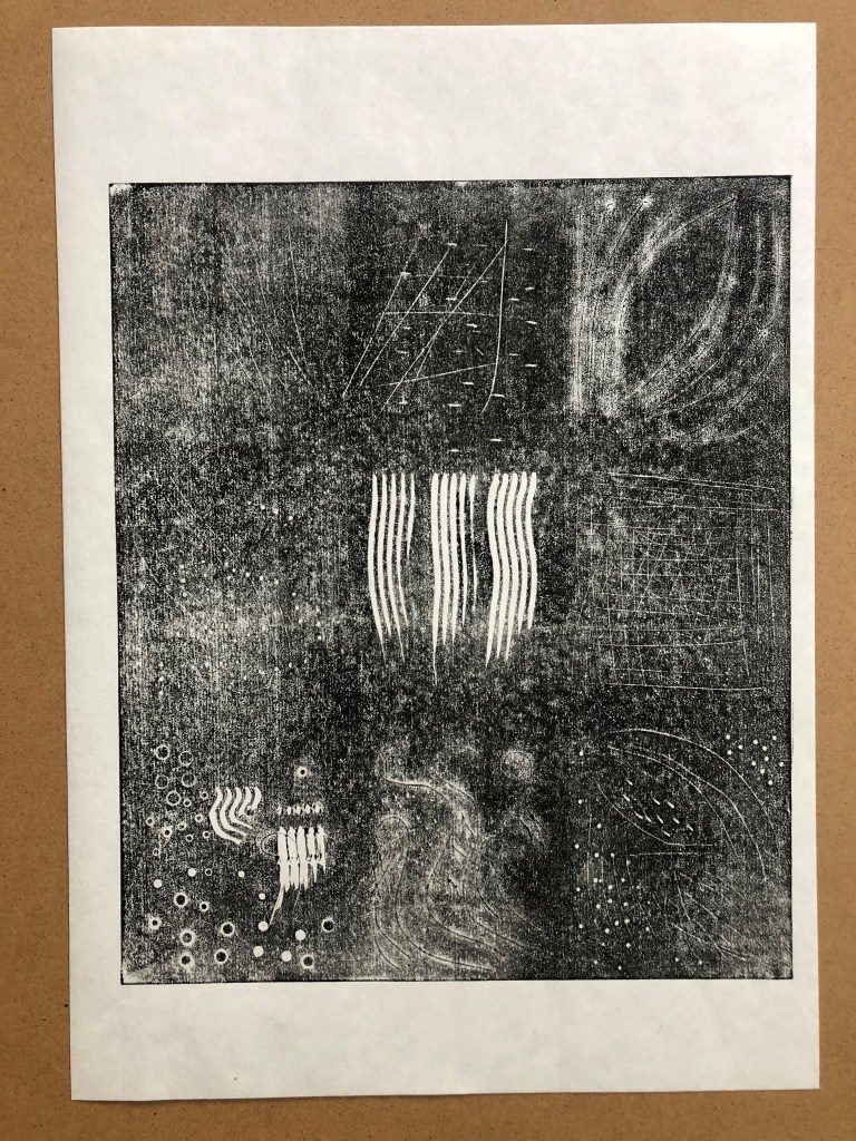
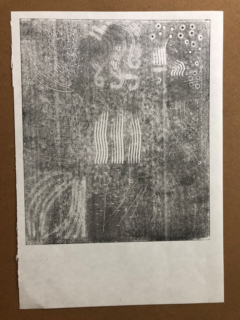
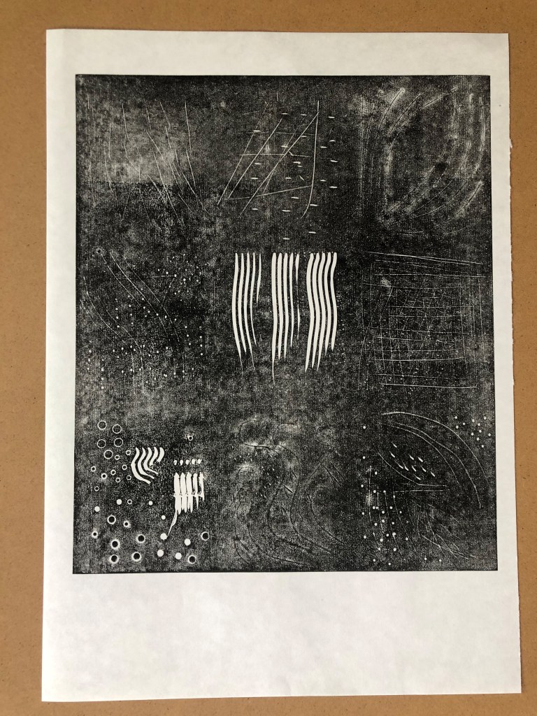
Hopefully, there are discernible squares marked out on this Lino plate. They were numbered 1-9 reading top down, left to right. The tools used to cut into, or at least to mark the the surface of the lino, are as follows.
Steel intaglio tool, double ended. I used both ends of this tool. I pressed both the end point and the side curve into the lino. I found that this created strong marks in the lino which in turn printed clearly lines and dots.
Exacto knife. This cut very fine lines, as perhaps one might expect from a sharp knife. The deeper the cut the more unwieldy this tool became so that my attempts at cutting curves into the surface of the lino became angular in nature. Post print these registered as dark lines instead of white as the cut marks simply filled with ink.
Hole punch and eylet setter tools. These two tools were limited in their reach beyond the edge of the lino. These could be used effectively as border tools perhaps. Maybe for the centre of a flower or a jewel? Post print these printed as clear and perfect circles or little eclipses (sic)
Tweezers. I wasn’t expecting a great deal from these. They make marks of parallel lines and indents by pressing the tips into the lino. Post print these made clear lines as part of the print.
“Thing“. My partner provided this item. I suspect it’s a drill bit of some kind. It’s a bit like a cylindrical mace. I was unconvinced that anything would show up in the final print, as I simply rolled this item on its side along the lino. Post print it did however just show up as a uniform series of white dots.
Pencil/pen. These were good for drawing onto the lino. When it came to printing they barely showed up at all. Using a biro I drew a simple figure which was not clear on any of the prints.
Hacksaw blade. This was satisfying to play with, making obvious score marks in the very top of the lino surface. I felt confident that the print would show these marks clearly, however, they were not as obvious as all that. They were ink-filled lines, so black on black.
Bulldog clip. Parallel lines like the tweezers – bit deeper. I turned the clip onto its edge and scored lines that show clearly in the lino. I then made dents with the corners of the bulldog clips. Post print these were clear white lines and dents in the print.
Sandpaper. This made nice highlighted areas on the lino but did not show up whatsoever on the print. I then used the edge of a Philips screwdriver to make bark-like impressions but these showed up in the final print as mere lines.
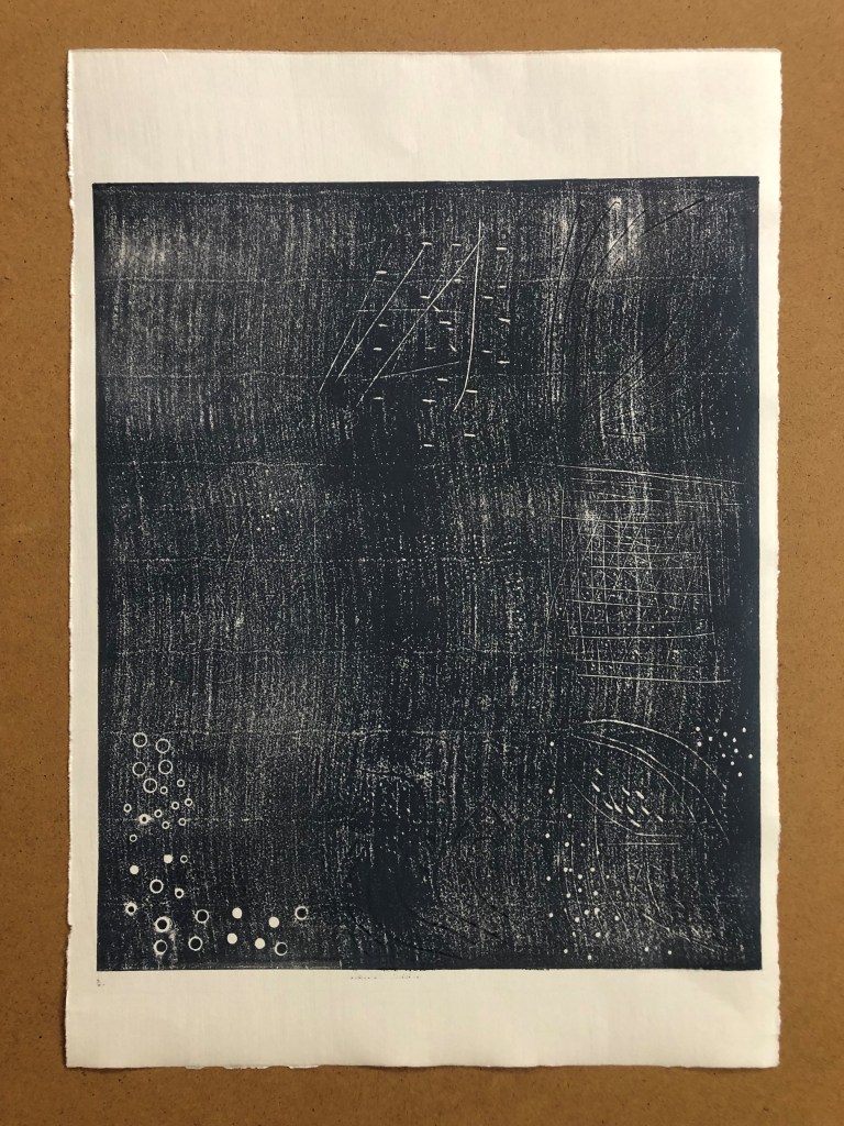
At first I suspected this exercise to be a waste of time, effort, resources and of my patience and personal safety in using blunt tools where well-maintained tools are prerequisite.
If planning to do any kind of lino cutting, you can’t really go too wrong with a set of decent lino cutting tools. Rather than attempting to reinvent the wheel using a fork or a knife, for example, what’s wrong with simply investing in a good Pfeil set?
However, I persevered. I tried stabbing the lino with a fork and dragging a Philips screwdriver along the surface of the lino. This did not change my view, until I tried to cut using a zester.
I made several marks using this tool from my partner’s kitchen. As well as this, I used a standalone hole punch which, by simply pressing the tip into the lino, cuts satisfyingly perfect holes every time, and wherever you wished to place them.
I used Somerset White 300gsm paper, Hosho paper, and Zerkall 120gsm for this project. I have not varied the ink colour particularly. I was attempting to gain a clear representation of the plate by varying the amount of ink I applied rather than varying the colour.
Strangely, the best representation of the lino plate in print form has been by using the lightest touch with black ink. Each of the cuts in this instance are clearly visible on the lightly inked print. I intend submitting one other pre-zester print just for completion.
Paul Catherall Down and Out in Paris and London (2013)
I have tried to work out how Paul Catherall has achieved this lino cut which, to me, feels strongly reminiscent of cubist works by Georges Braque and Pablo Picasso. I have no idea whether George Orwell, the author of the book Down and Out in Paris and London, for which this image is the cover design, was an aficionado of Absinthe-fuelled meanderings in amongst the narrow streets of Montmartre. I haven’t read the book. However, this is how it makes me feel and think as a view this image. Even the colour of the ink used hints at the wicked green fairy. It does at least make me curious about the contents of the book.
The clean lines and overlapping colours suggest the character of both cities viewed through a slightly skewed lens. This is the image that first prompted me to revisit an earlier sketch I had produced during the previous unit Drawing Skills. My approach to this image, of several women engaged in yoga warrior poses, had been inspired by the work of the cubist movement. I had first experimented with layers on my multi-colour linocut in the previous part of the intro to Printmaking unit. Paul Catherall’s work was very much in mind as I designed and cut the lino for Bottle Alley. I then used his work as a springboard to start a larger scale image for the theme of Life Form with several figures.
Paul Catherall’s image is a consistently skewed view without any figures present. My image of Yoga Warrior Poses is a little confused by comparison. Limbs intermingle. Some of my figures appear to have essential limbs completely missing, whereas others have more than their fair share. Also, I feel I have produced something with inadvertently salacious undertones in that the figure on the left appears to be about to strike the bared and vulnerable rear of another, more central figure. I have spent too much time on this, however. Although the outcome is not ideal, it does have some interesting shapes and colour combinations.
Since starting this reduction lino cut, I have reviewed my degree pathway choice. I have been transferred from the Drawing Pathway to the Illustration pathway. While I take both seriously, I feel myself breathe a huge sigh of relief in the fact that Illustration feels so much more apt to my approach to mark making. To me, art should be a fun activity. Art with a capital “A” always appears to be so serious.
Paul Catherall’s work, used here for illustration purposes for the Orwell book, would comfortably straddle both art camps. It is both commercial and manages to convey a glacially cool quality to recognisable pieces of architecture such as Tate Modern and Battersea Power Station. This artist shows the simple beauty that is not always immediately apparent in such structures. He does this in a seemingly effortless way by selection and simplification of its most prominently recognisable features. This is what I appreciate about the work he produces, that simplicity equates to beauty.
Maureen Walker Warriors in the Sun (2021) Reduction linocut
I’m not certain that I have achieved this level of effortless simplicity in my rendition of the yoga poses. Bottle Alley however, is simple and suggests a sense of emptiness and isolation that is inherent in an out of season seafront in an impoverished town during lockdown.
I began the day fully convinced that I was going to pursue the chameleon option to conform to the set theme of “Lifeform” for this project. But having seen an almost identical composition online, I felt my conviction weaken.
Original thoughts for a chameleon design for Project 8
When I tried using my scanner this morning, it was being decidedly mercurial. Whilst trying in vain to scan the chameleon design I fell upon a sketch I had done previously that met the lifeform theme criteria perfectly. If I could only simplify the image.
Yoga poses in the sun
With Picasso’s principles behind his bull sketches firmly in mind, I set about doing just that. Picasso had famously pared his sketches down to their essence with his series of sketches of a bull.
As I drew, I had the spirit of Picasso murmuring jealously on my left shoulder whilst on my right an angel sat attempting to counteract his scathing remarks over my attempts to learn from his practice.
I spent the best part of a day on this series of sketches, refining the image until I was happy. It took the following renditions to arrive at some semblance of satisfaction. But I feel the resulting image is workable as a linocut.
This final coloured sketch leaves me feeling a sense of achievement
There is something of the 1920s about this image. Prior to designing it today I had been looking at Modernist British Printmaking in the book entitled Cutting Edge. Inside its covers are marvellous minimalist images. These, plus Picasso’s approach to his bull sketches led me to pare down my idea as far as I felt necessary for a successful linocut design.