In a career that spanned just 6 years and ended at a mere 25 years of age, Beardsley produced more than a thousand drawings.
Photographic print processes appeared to rise up to the challenge of doing justice to his work. A zinc line block process faithfully reproduced the seas of black ink intertwined with complementary tendrils of white. These formed stylised representations of the human form engaged in the heights of emotional ecstasy as well as the depths of what some might term depravity.
Beardsley, a man of independent fortune, appeared to be free to roam with his visual depictions of the overtly sexual human form. There seems to have been little in the way of societal prohibition through which to curb his fantasies and therefore effect his outcomes. Perhaps with no ‘master of the wallet’ to dampen his soul and keep the reins taut, Beardsley allowed himself to run creatively amok.
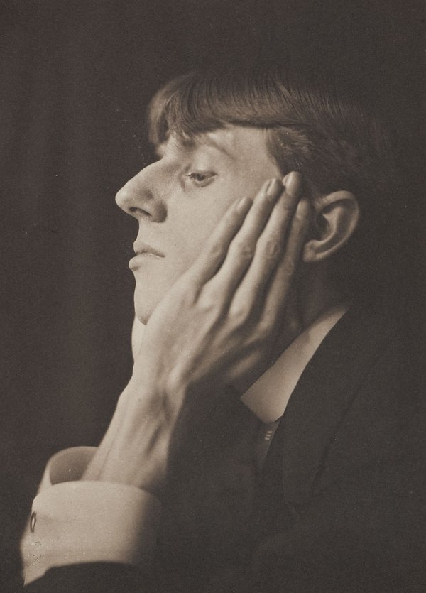
Self Portrait (1892) Aubrey Beardsley
References:
Calloway, S. et al. (2020) Aubrey Beardsley. London: Tate. Tate (no date)
I thought that these images had been produced by some kind of printmaking method. I did not realise that they were acrylic paintings on board. They are highly reminiscent of early, and rather clumsy, attempts at representing landscape in computer animated simulator machines devised for the purpose of training pilots how to land helicopters and the like in dangerous situations and environments.
City Wall (2018) Vanessa GardinerTrevalga (2018) Vanessa Gardiner
I don’t really know what else to add to my comments on these works. I think I approve of the fact of their minimalism. The colour choices are in keeping with the natural world of landscapes, but I wonder whether a more urban subject matter may enhance the effect of the chosen medium/method. A few colourful buildings and even a few figures sprinkled about? But then the artwork, and what it sets out to achieve would be transformed. Perhaps that’s not the artist’s aim?
I confess to not knowing what the artist intended. A minimalist outcome has been achieved. But has anything been added by reproducing very similar images using the same method other than the obvious increased quantity?
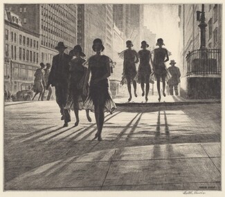
Due to its atmosphere of impending drama, this aerial view Night Shadows (1921) could easily be a panel from a graphic novel. This evokes a feeling of mystery unravelling before our eyes. There is plenty of scope for the later addition of thought bubbles etc as the character in the hat considers where he has just been or where he is ultimately headed.
Night Shadows (1921) Edward Hopper
In 1923, after winning two prizes for etchings he had produced between 1915 and 1923, Hopper turned his attention back toward painting once more. The output from this was in turn influenced by his subject choices and compositions used for his etchings. I feel his work was over all influenced by the severe contrast necessary to produce outcomes with impact whilst printing using only black ink. These stark images speak of urban stories untold.
Night on the El Train (1921) Edward Hopper
Here is what could easily be interpreted as either a representation of a couple about to be engaged in an embrace whilst travelling by night on a train, or an innocent and unsuspecting man being cornered and harassed by a strange woman. The atmosphere created by the composition hints equally at either narrative. Again, a caption would not not be out of place here.
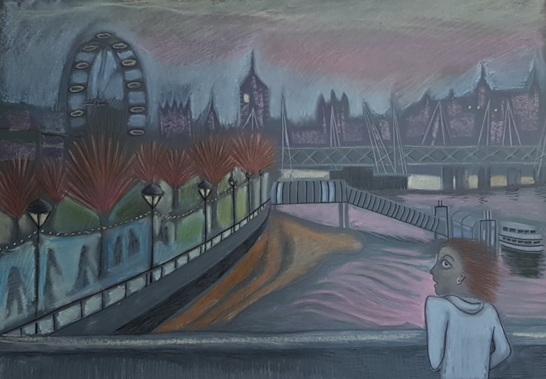
Again, I refer back to my composition, Waterloo Sunset (2020) to show that these influences have made their mark, even if I was not aware of these artists at the time, their output is not unfamiliar to me from browsing online and from magazine articles on printmaking etc.
Waterloo Sunset (2020) Maureen Walker
Landscapes such as these, once the addition of a figure or two has been made, become stories in the making as we ask ourselves, What? When? Who? Where? or Why?
There’s something about this image that speaks, screams of the seedy underbelly of a city by night. The fact that there is line upon line of washing hanging out to dry, places this piece in a time before the pervasive hum of the tumble drier seeped through the walls of one’s high rise flat and directly into one’s subconscious.
Across the gardens we can see that all the lights are on in the windows. Judging by the dated clothing worn by the figure in the foreground, this is somewhere between the wars. But, of course, the date of the piece (1929) kind of gives the game away.
This piece illustrates the hours following having worked fingers to the bone. Whether that be at the coal face, or at the punishing front line of typewriter keys, the result is much the same. There is a feeling of sweat and tears about this image. The level of tonal contrast together with the composition – the foreground figure taking up about a third of the space from the left, and the buildings in the background using up a third of the horizontal plane. It puts me firmly in mind of my drawing “Waterloo Sunset” due to the figure in the foreground being mirrored by my figure on the bridge.
Waterloo Sunset. (2020) Maureen Walker
However, where my figure is isolated by the scene and appears vulnerable, Martin Lewis’s female figure, whether she likes it or not, seems to be very much at home, or at least resigned to the fact that she is present in her home environment.
Looking at his other works it is clear that Martin Lewis was a huge fan of the long shadow. Here is a good example.
Shadow Dance (1930) Martin LewisMorrison’s Crowd (2020) Maureen Walker
This blog post has corralled together an unusual grouping. The first is an obvious choice for an art student. The recent retrospective at Tate Modern, which I missed out on, included the instantly recognisable Marilyn Monroe portraits by Warhol, in all their unabashed glory. This art, with the colour and nutritional value of a fondant fancy, is at once unique, and trashily disposable. It captured a zeitgiest in a throwaway world where pop was king.
Andy Warhol attached himself to a beatnik counter-culture, associating with the music world via singers such as Nico and the band The Velvet Underground. A reputedly shy man originating from Slovakia, Warhol was a successful self publicist by proxy. He was reputed to have championed the career of Jean Michel Basquiat having met him whilst Basquiat was selling work on the street.
His images shout about celebrity and the nature of consumerism. A silk screen dream of the banal. But in amongst the brash and the infamous, the Monroes and the Campbell’s Soup Cans, was to be found a delicate sensitivity for the frail and transient nature of human beauty in the form of the delicate line drawing, “Boy with Flowers” (1955-57).
I hope to get a chance again to see his work in person. However I suspect this may not come my way twice in one lifetime.
Louise Bourgeois
The famous spider that took up temporary residence in Tate Modern’s yawning space during opening of Tate Modern in May 2000 is said to be a representation of the artist’s mother, or, at least representative of the artist’s relationship with her mother. A more rationally “phobic” symbol would have been difficult to find. Perhaps one could be forgiven for misinterpreting the relationship? Bourgeois said of her mother that she was, “deliberate, clever, patient, soothing, reasonable, dainty, subtle, indispensable, neat, and useful as an araignée. She could also defend herself, and me, by refusing to answer ‘stupid’, inquisitive, embarrassing personal questions.”
Seen from below there are eggs cradled within the arachnid’s giant abdomen. Did Louise Bourgeois feel like those eggs? Vulnerable enough, I’m certain. To be faced with the drop from such an unconventional embrace? And that is your childhood? To be so cradled? I do wonder whether, through being handled thus by her nearest and dearest, Louise Bourgeois was then driven to produce art far beyond the imagination of other mortals, who instead enjoyed the comforts of a warm fur-lined basinet.
My Inner Life 2008 Louise Bourgeois 1911-2010 Lent by the Tate Americas Foundation, courtesy of the Easton Foundation and Osiris 2016 http://www.tate.org.uk/art/work/L03833
The Voice Says Yes 2009 and I Give Everything Away 2010 were a series of etchings by Louise Bourgeois. These appear to be abstract representations of how she feels about “being”. I confess that I have been to so many exhibitions in the past that I’m not certain whether I saw this one, or if I simply caught these images online. Context is so key and this exhibition took place prior to my commencement of the degree course. Placing it in the context of an important exhibition from an artist nearing the end of her life, was not in my mind at the time, if in fact I was even there.
Yong Ho Ji
Scratching around for some originality in representing animals in art I found myself rejecting the cute and cuddly in favour of those more phobia-inducing critters. Yes, spiders included. This artist is included as contrast, a bit of fast food in the midst of Cordon Bleu.
I suspect there may be a risk of becoming a one-trick pony for this artist who has made a name for himself by cutting up old tyres and rearranging them to form wild beasts. I do hope he doesn’t meet this fate of typecasting. I included “that Korean tyre guy” in my trio of lifeform representational artists, as he too includes a spider-like creature with just three legs. This tri-ped appears less caustic and dangerous than Louise Bourgeois’s spider, possibly due to the artist’s chosen medium. One imagines if it were possible to touch one of his sculptures that it would be slightly warm and give way to a degree under the slightest pressure. This is in stark contrast to the Bourgeois spider which is serious in its portrayal of humanity. The Bourgeois spider looms large and out of reach to mere mortals. Yong Ho Ji’s creature gives the impression of being prone to toppling and having its belly tickled at a moment’s notice with little risk of remonstration.
The medium, recycled tyres, does at least remind me of the wasted resources we steal away on a daily basis from our fellow creatures and the tentative hold we each have on life on earth.
Paul Catherall Down and Out in Paris and London (2013)
I have tried to work out how Paul Catherall has achieved this lino cut which, to me, feels strongly reminiscent of cubist works by Georges Braque and Pablo Picasso. I have no idea whether George Orwell, the author of the book Down and Out in Paris and London, for which this image is the cover design, was an aficionado of Absinthe-fuelled meanderings in amongst the narrow streets of Montmartre. I haven’t read the book. However, this is how it makes me feel and think as a view this image. Even the colour of the ink used hints at the wicked green fairy. It does at least make me curious about the contents of the book.
The clean lines and overlapping colours suggest the character of both cities viewed through a slightly skewed lens. This is the image that first prompted me to revisit an earlier sketch I had produced during the previous unit Drawing Skills. My approach to this image, of several women engaged in yoga warrior poses, had been inspired by the work of the cubist movement. I had first experimented with layers on my multi-colour linocut in the previous part of the intro to Printmaking unit. Paul Catherall’s work was very much in mind as I designed and cut the lino for Bottle Alley. I then used his work as a springboard to start a larger scale image for the theme of Life Form with several figures.
Paul Catherall’s image is a consistently skewed view without any figures present. My image of Yoga Warrior Poses is a little confused by comparison. Limbs intermingle. Some of my figures appear to have essential limbs completely missing, whereas others have more than their fair share. Also, I feel I have produced something with inadvertently salacious undertones in that the figure on the left appears to be about to strike the bared and vulnerable rear of another, more central figure. I have spent too much time on this, however. Although the outcome is not ideal, it does have some interesting shapes and colour combinations.
Since starting this reduction lino cut, I have reviewed my degree pathway choice. I have been transferred from the Drawing Pathway to the Illustration pathway. While I take both seriously, I feel myself breathe a huge sigh of relief in the fact that Illustration feels so much more apt to my approach to mark making. To me, art should be a fun activity. Art with a capital “A” always appears to be so serious.
Paul Catherall’s work, used here for illustration purposes for the Orwell book, would comfortably straddle both art camps. It is both commercial and manages to convey a glacially cool quality to recognisable pieces of architecture such as Tate Modern and Battersea Power Station. This artist shows the simple beauty that is not always immediately apparent in such structures. He does this in a seemingly effortless way by selection and simplification of its most prominently recognisable features. This is what I appreciate about the work he produces, that simplicity equates to beauty.
Maureen Walker Warriors in the Sun (2021) Reduction linocut
I’m not certain that I have achieved this level of effortless simplicity in my rendition of the yoga poses. Bottle Alley however, is simple and suggests a sense of emptiness and isolation that is inherent in an out of season seafront in an impoverished town during lockdown.
On the 9th Jan I wrote the following paragraph in my blog post “Tate Modern: Matisse’s Cut Out Exhibition”
“I feel that the reason that Matisse’s cut outs have so much impact is that his wealth of knowledge around effective colour and tonal contrast, as well as his awareness of the conventions of composition, are so well established from his years of painting experience. His subtle hints at the nuances of the human form keep me highly engaged, both in the quality of the outcome as well as the use of the medium, especially given his physical condition at that time in his life.”
I’d like to add the above image the better to illustrate my point. The parallels between his cut outs and the effect a cut piece of lino has on white paper is clear from looking at these “Blue Nudes”. They are also faintly reminiscent of white on blue Wedgewood Jasperware ceramics, Though clearly the figures are less classic in design, the impact of the colour combination reminds me of these pieces.
Moving on,
Caroline Macey
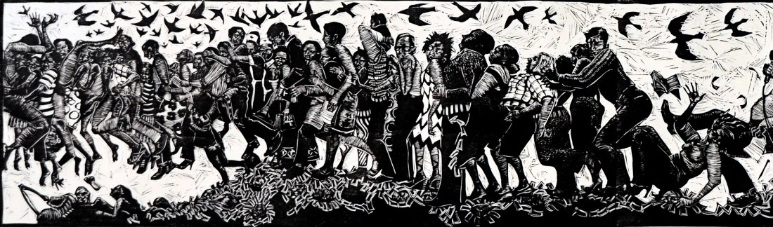
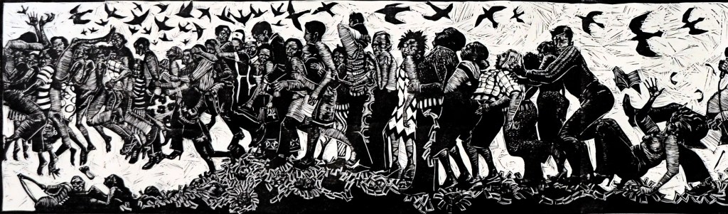
Rock and a Hard Place
I love this work, not only due to its subject matter of the hardship inherent in a life on the periphery of survival. I like it because it attempts to tell a story about the challenges of life lived in a sometimes harsh and uncaring society. The bold contrasting elements in black against bleak white illustrates life’s struggles well. This artist does a lot of her prints in this stark black on white way. Her work is distinctive and often seems apocalyptic in nature. Her figures appear to be animated in a symbolic manner, rather than evocative in a decorative way, such as those in an Angela Harding print, for example. I had trouble showing an example for comparison, though Angela Harding’s website is well worth a visit. Her combined lino cut and silk screen print “Salt Path” is a wonderful example of this, having been created to complement a book with a bitter sweet storyline.
I like the above image of “Rock and a Hard Place” so much that I have ordered a print. I feel that, due to her individuality, this artist is definitely one to watch.
ShelleyBurgoyne
This artist has inspired me to work more fully with my drawing practice alongside printmaking. Her use of near-abstract forms using pen and ink, in her work “memory of the blanket story” for example are stimulating in that I feel myself drawing something, if not similar, then certainly something in response to having viewed it. Or, at least to dig work I have already produced out of my Drawing 1 portfolio and to rework it further using the impetus inspired by Shelley’s work.
S Burgoyne “Memory of the Blanket Story” Textile Stitch Print 60 x 84 cm
Morgan Doyle
Morgan Doyle Mixed Media Collage “Escapada Series”
Again, viewing this artist’s work leads me to a hunger for more personal exploration of my own. This is particularly true in the area of mixed media collage techniques. The urge to cut up the imperfect prints I have produced as well as the packing paper I have used to protect surfaces in my studio, is strong. Though I have yet to give in to this urge, due to the limitations I place on my time as well as my own fear of failure, having viewed these artists’ work, I shall do so very soon.
Henri Matisse certainly knew how to use colour combinations effectively. The way he describes shapes with minimal style led me to come away from this exhibition clutching a swathe of postcards depicting this artist’s work. That, together with a feeling that my senses had been highly stimulated, made this a memorable exhibition.
We visited Tate Modern back in 2014 to see this. I remember enjoying it. But I now feel mystified when having just read the suggestion on the Tate website that Matisse was the inventor of a “new medium”.
“In his late sixties, when ill health first prevented Matisse from painting, he began to cut into painted paper with scissors to make drafts for a number of commissions. In time, Matisse chose cut-outs over painting: he had invented a new medium.” (Tate.org 2014)
For the sake of accuracy, did he not just take one that was already very much in existence and dare to lend it credibility by his highly effective adoption of it? It does beg the question, did someone not think of it before then? For how long have we had paper, scissors and paste at our disposal? Surely these were not invented in 1936 when this series of artworks were first produced?
As a creative species, it’s not altogether unrealistic to hint at the possibility of suggesting that the true evolution of that medium came about from an individual or a group of the female persuasion? Thus deemed “unworthy” by those incumbents of the lofty marble halls of the art world, that same group have gone on unnoticed and therefore unmentioned into the annals of time.
Though these “women scorned” may well have been unmoved by ego, disinterested in being “recognised” as artists, or simply figments of my own active imagination, I feel the need to mention the real possibility of their existence regardless.
I feel that the reason that Matisse’s cut outs have so much impact is that his wealth of knowledge around effective colour and tonal contrast, as well as his awareness of the conventions of composition, are so well established from his years of painting experience. His subtle hints at the nuances of the human form keep me highly engaged, both in the quality of the outcome as well as the use of the medium, especially given his physical condition at that time in his life.
Since writing this post I have been sent a link to The Economist “Stick ’em Up” article on “the Surprising History of Collage”. Evidently the world’s moved on since 2014, Doh!
Due to COVID-19 restrictions, The Royal Academy are forced to close their doors on The Tracey Emin and Edward Munch exhibition, as well as The Late Summer Exhibition. So, as with many others, having re-booked once already, I am yet again left disappointed. The following blog post may be heavily reliant upon internet research. Luckily though, I have a copy of Emin’s “One Thousand Drawings” (2009) on my shelf.
A hefty volume by anyone’s standards, the aforementioned book shows hours upon hours of spontaneous work. I feel Tracey Emin, setting her internal filter aside, has poured her soul out onto the page. Amid many crossings out, she writes; “I am the custodian, the curator of the images that live in my mind.” (2009) She goes on to say “Every image in this book…has first entered my mind – travelled through my heart, my blood – arriving at the end of my hand.” (Emin. T. 2009)
I like the fact that these drawings, rather than mere progressions toward a finished outcome, have been presented together as a collection of outcomes in themselves. Though there is little evidence of concern around anatomical accuracy – or of light and shade in terms of representational reality – light and shade of another kind are prevalent here. These images are illustrative of harrowing emotional experiences – drawing from “life” – rather than “Life Drawing “.
At first I thought it was just a rip-off book filled with crap drawings. But now, given the context, I view them differently. There is both an immediacy and a sense of urgent imperative about them that is almost alarming.
Emin, T. (2009) One Thousand Drawings
If we compare, the diners appear animated in one image. In stark contrast, the other depicts a similar scene from a different angle. We as viewers have been cast as the diner at the head of the table. All eyes are upon us. They regard us expectantly as though awaiting disappointment. It is as though Emin puts us in her shoes – to experience life through her eyes. As she feels the heat of social scrutiny, so do we – at least we can imagine.
Tracey Emin, in the face of opposition from critical eyes and tongues, takes her art seriously. I see that she has respect for her art in the way that she has expressed herself – in this case – through the medium of drawing, and back-drawn monoprints. Therefore, others have taken her art seriously. At least her publisher appears to have done. The galleries who exhibit her work evidently do, unless driven entirely by monetary forces.
I question whether an artist needs the approval of everyone in “The Establishment.” Then I find myself questioning the definition of that word/phrase. I wonder what it means to “establish” oneself as an artist. Is it just the ability to sell stuff? If so, Etsy and the like would count as “establishment”. Who exactly do we mean when we say that? Gallery owner; monied individuals; or is it all just smoke and mirrors? Perhaps it’s simply the ability as an artist – like any other celebrity – to kick up a right stink about ourselves?
References:
Emin. Tracey. (2009) One Thousand Drawings. New York: Rizzoli International.
The above print colour is far too dominant as it is. The feint blue and yellow of the initial layers can barely be seen. When it’s had a chance to dry I shall soften this effect with a white ink layer using items such as lace, doilies, feathers and leaves as masks.
The following print has stronger first layers in yellow and blue. Thinking about it I should have used an alternative colour combination for the initial layers so that my third layer could complement them both. I’m thinking of colours closer together on the colour wheel such as yellow and orange or green and blue.
The red ink is a little overpowering
I’m feeling a bit strung out as I am awaiting the results for my November assessment for Dr4drs. It’s taking a lot of my head space. They should arrive via email sometime this week. I have just 3.5 weeks before I need to post my first assignment on this module. It should be plenty of time, but I need to be more productive than I have been in order to meet this deadline.