Category: Notes
Add posts containing notes to this category.


Summary of Learning Outcomes: Introduction to Printmaking
Looking again at my tutor feedback forms from the course, I have reached the following conclusions in relation to four Learning Outcomes for this unit.
Learning Outcome 1: Demonstrate use of drawing to develop your visual ideas
I have enjoyed this process-oriented medium immensely. As a result, I have concentrated more on the process of learning about how best to pull a successful linocut, for example, than I have about development of designs. This is not to say that I have not thought about the development process. There is evidence of this in my sketchbook. It is simply that I have arrived at my desired design outcomes comparatively quickly. As a consequence, drawing has perhaps been my weakest area on this unit. Even though, on both the Drawing Skills and the Intro to Printmaking units, I do use my sketchbook for planning compositions and for recording reference material, it is my intention to further develop my skills of draughtsmanship and composition.
Learning Outcome 2: use a range of printmaking techniques and media
Throughout this unit I have used a wide variety of media and techniques to achieve positive outcomes. Learning much along the way about this highly process-oriented medium, I have gained so much confidence in my ability both to adapt subject matter to suit the medium, and to choose the right medium/method to create a particular effect. This has been true in both my coursework and in side projects, for example discarding one approach to creating a print of a tree with Linocutting techniques for the more detail-friendly intaglio dry point etching technique. Though this technique is not included in this unit, it illustrates my interest in printmaking in general and not just within the parameters of the structure of the unit.
For projects strictly within the course, I have tried to use complementary techniques to best achieve the production of positive outcomes; this has been largely successful. Indeed, I have been pleasantly surprised by the level of enthusiasm with which my work has been received. Sometimes this level of surprise has been quite strong – notably where a highly intuitive approach was required, as in the abstract collagraph. I had low confidence in my outcomes, as this represented new territory in subject matter as well as in method used. But my tutor’s response brushed aside all reservations I had. It is times like these I feel my levels of confidence and self believe really do grow.
Learning Outcomes 3: understand the historical and contemporary contexts that inform your work
As COVID rules begin to loosen up, I am revisiting London haunts such as the Royal Academy and the V & A. I have begun to look at ebook resources on the UCA website instead of relying totally on more general internet resources. I have also reached out to other artists, including Caroline Macey and Paul Catharall to seek advice on the printmaking process.
I have attended the RA exhibitions on Tracey Emin and Edvard Munch, as well as on David Hockney’s latest exhibition. I intend to do more in this vein in the near future. There are indirect historical influences in regards to some of the designs, including church window designs in my personal project, and cubist designs in my reduction print project.

Learning Outcome 4: reflect upon your own learning experience
My ability to reflect upon my work in relation to That of my contemporaries has also improved. This has been due in no small part to my tutor’s responses to my work and to my reflection on my outcomes. Also, her recommendation to read and absorb the Gerda Williams book “How To Write About Contemporary Art”, has been a formative influence. I feel I am beginning to get a grasp of how best to communicate my ideas when writing about my own, as well as other artists’ work. I have learned that in order to communicate more widely and successfully, it is necessary to think about what is relatable on a universal level, rather than simply list the specifics of one’s personal experience. Rather than say “I chose the head of a Buddha for a still life subject due to having been given said item by my brother who found it in a skip one day”, I can speak of my finished outcome being about universal experiences such as “memory” “personal history” or “emotion”. At first, this seemed a little vague, and I admit I’m still trying to get to grips with this concept. But I can see why speaking in universal terms helps others to identify contexts, even though they have walked a different path from me.

Rejected Works for the Dump

Although I have deemed all of the following unworthy of the storage space required to keep them, my partner pointed out that many, if not all, could legitimately be used at a later date as ideas for prints.


Sketchbooks


Part 1:Project 3: Variations using masks and multi-colours

The above print colour is far too dominant as it is. The feint blue and yellow of the initial layers can barely be seen. When it’s had a chance to dry I shall soften this effect with a white ink layer using items such as lace, doilies, feathers and leaves as masks.
The following print has stronger first layers in yellow and blue. Thinking about it I should have used an alternative colour combination for the initial layers so that my third layer could complement them both. I’m thinking of colours closer together on the colour wheel such as yellow and orange or green and blue.

I’m feeling a bit strung out as I am awaiting the results for my November assessment for Dr4drs. It’s taking a lot of my head space. They should arrive via email sometime this week. I have just 3.5 weeks before I need to post my first assignment on this module. It should be plenty of time, but I need to be more productive than I have been in order to meet this deadline.
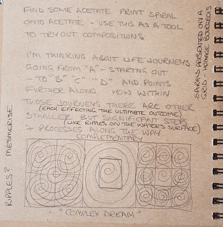
Spirals

I’ve always liked spirals. I’d drew them constantly as a child. Starting in the centre of my paper, I’d link them up to form a plant like structure with spiral branches leading off to further sprouting spirals until I’d run out of space. Then I’d gift these to family members (whether they appreciated them or not).


I have mixed feelings about Matisse’s Snail (1953). I’m always trying to make sense of the form of a snail within these sections of colour. Rather than bang my head against the wall in pursuit of the impossible, I think I’d get more joy from appreciating how he has chosen colours that bounce pleasantly off one another.
References:
Tate. ‘“The Snail”, Henri Matisse, 1953’. Tate. Accessed 1 December 2020. https://www.tate.org.uk/art/artworks/matisse-the-snail-t00540.
Part 1: Project 2: Positive and Negative Masked Monoprints Continued

I learned last week that my ceramic tile plate lacked the definition required for clean sharp print edges, so I returned to using a glass plate. The template happened to fit this glass plate all but perfectly. I brushed the ink onto the plate this time, rather than using a brayer like last week.


I still need to be more scrupulous with keeping plate and inking surfaces clean to avoid spots on my prints. I’m pleased that the placement of the paper has improved markedly on initial experiments. This is due to lining up the long side of the plate parallel to the table edge. Then by lining up the short edge of the paper parallel to the short edge of the plate and then rolling the paper carefully down onto the plate – keeping both the long and short edges parallel.
I am as yet confused by definitions of what constitutes a negative print and a positive plate and vice-versa. I need to return to the course text and update this post accordingly.
Sketchbook

On Saturday I did some investigative play into cubist-inspired art. This is something I began in the previous (Drawing Skills) module. I began with drawing one large spiral on my iPad mini. Instead of colouring in between the lines I deliberately scribbled over them using the spiral as a guide only rather than as a rigid framework.

I then drew onto a printed copy which I then glued into my sketchbook.

I then drew four seperate spirals in my sketchbook.


I then thought about my violin shape.

I need to find a way to turn this design into a successful print. Perhaps by using the calograph technique.

I then drew a simple horse design and cris crossed it at strategic points with white lines. I then highlighted areas with white pencil again and then shaded in others using a B pencil.

Part 1:Project 2: Design for template/stencil/mask


Perhaps not the best sketch I’ve ever completed, but it illustrates my thinking adequately enough to move on to a finished design for my first positive/negative masked monoprint.

From this outline, I produced the following design. I took several photocopies of this so that I could produce a few different masks.

I’m quite happy with the final first design. I’ve left out the bow on this occasion as it’s so much longer than the violin and would require my scaling the design down in order to fit in the bow. I will add this into the mix as well as any other items such as gloves and/ or musical notes in a later version, I think.
Part 1: Project 2: Initial Sketches


This is “Vera”, my most precious and prized possession. I’ve been learning for over three years now. I am just around the stage where music fills my ears when I play. A few months ago I was still making a bit of a racket.
The process of simplifying these images is very gradual. I find myself reluctant to “let go” of details such as strings and the spiral of the scroll. But they must both go as to include them in my template/stencil project would likely detract from, rather than add to, the effectiveness of the final outcome.
These sketches, which I chose to draw directly using a sharpie in order to reduce “preciousness”, read top down from left to right. I think you can tell by the lack of simplification how I am loathe to part with detail. My partner sent me this image as encouragement.

Not a bad rendition in my humble opinion.
References:
Purchase. CJ. (2020) “iPhone sketch” Private collection
