Category: Research & Reflection
The parent category for research and reflection posts.


Summary of Learning Outcomes: Introduction to Printmaking
Looking again at my tutor feedback forms from the course, I have reached the following conclusions in relation to four Learning Outcomes for this unit.
Learning Outcome 1: Demonstrate use of drawing to develop your visual ideas
I have enjoyed this process-oriented medium immensely. As a result, I have concentrated more on the process of learning about how best to pull a successful linocut, for example, than I have about development of designs. This is not to say that I have not thought about the development process. There is evidence of this in my sketchbook. It is simply that I have arrived at my desired design outcomes comparatively quickly. As a consequence, drawing has perhaps been my weakest area on this unit. Even though, on both the Drawing Skills and the Intro to Printmaking units, I do use my sketchbook for planning compositions and for recording reference material, it is my intention to further develop my skills of draughtsmanship and composition.
Learning Outcome 2: use a range of printmaking techniques and media
Throughout this unit I have used a wide variety of media and techniques to achieve positive outcomes. Learning much along the way about this highly process-oriented medium, I have gained so much confidence in my ability both to adapt subject matter to suit the medium, and to choose the right medium/method to create a particular effect. This has been true in both my coursework and in side projects, for example discarding one approach to creating a print of a tree with Linocutting techniques for the more detail-friendly intaglio dry point etching technique. Though this technique is not included in this unit, it illustrates my interest in printmaking in general and not just within the parameters of the structure of the unit.
For projects strictly within the course, I have tried to use complementary techniques to best achieve the production of positive outcomes; this has been largely successful. Indeed, I have been pleasantly surprised by the level of enthusiasm with which my work has been received. Sometimes this level of surprise has been quite strong – notably where a highly intuitive approach was required, as in the abstract collagraph. I had low confidence in my outcomes, as this represented new territory in subject matter as well as in method used. But my tutor’s response brushed aside all reservations I had. It is times like these I feel my levels of confidence and self believe really do grow.
Learning Outcomes 3: understand the historical and contemporary contexts that inform your work
As COVID rules begin to loosen up, I am revisiting London haunts such as the Royal Academy and the V & A. I have begun to look at ebook resources on the UCA website instead of relying totally on more general internet resources. I have also reached out to other artists, including Caroline Macey and Paul Catharall to seek advice on the printmaking process.
I have attended the RA exhibitions on Tracey Emin and Edvard Munch, as well as on David Hockney’s latest exhibition. I intend to do more in this vein in the near future. There are indirect historical influences in regards to some of the designs, including church window designs in my personal project, and cubist designs in my reduction print project.

Learning Outcome 4: reflect upon your own learning experience
My ability to reflect upon my work in relation to That of my contemporaries has also improved. This has been due in no small part to my tutor’s responses to my work and to my reflection on my outcomes. Also, her recommendation to read and absorb the Gerda Williams book “How To Write About Contemporary Art”, has been a formative influence. I feel I am beginning to get a grasp of how best to communicate my ideas when writing about my own, as well as other artists’ work. I have learned that in order to communicate more widely and successfully, it is necessary to think about what is relatable on a universal level, rather than simply list the specifics of one’s personal experience. Rather than say “I chose the head of a Buddha for a still life subject due to having been given said item by my brother who found it in a skip one day”, I can speak of my finished outcome being about universal experiences such as “memory” “personal history” or “emotion”. At first, this seemed a little vague, and I admit I’m still trying to get to grips with this concept. But I can see why speaking in universal terms helps others to identify contexts, even though they have walked a different path from me.

Research Point: Corita Kent, Robert Rauschenberg, and Ed Ruscha
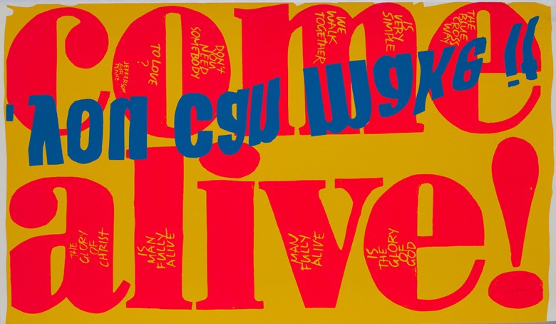
Corita Kent
Corita Kent’s prints are reminiscent of fast food packaging. Her work puts me firmly in mind of graphic art used as marketing for fast food and other types of packaging used for everyday items. It is eye catching and seeks to convey a spiritual as well as a social- political message. I was not certain whether these pieces were the result of collage or of printmaking, or a mixture of the two. I feel compelled to emulate the way she has used silk screen methods to create these messages, as she is using popular advertising methods to communicate age old ideas about faith and spirituality. Though my message would be less spiritually inclined, the spirit of spontaneous goodwill these pieces convey is hopefully contagious.
Robert Rauschenberg

Traces of drawing media on paper with label and gilded frame
Defacing another artists work, and calling it art? Hmm, not sure I approve of that. But I suppose that’s the point. As a publicity stunt it’s been rather effective for Robert Rauschenberg, as people are still discussing this subject today.
Ed Ruscha

With its cean, unfussy lines of minimalist architecture this painting conveys so much more than a simple service building. It evokes an era of American popular history. You can almost hear the 1950s car engines as they cruise by, all winged fenders and exaggerated curves. It also speaks of the similar treatment of advertising campaigns at the time. I can almost feel the baked tarmac melting in the sun.
References:
Ed Ruscha: Standard (2021) LACMA. Available at: http://www.lacma.org/art/exhibition/ed-ruscha-standard (Accessed: 5 July 2021).
Erased de Kooning Drawing (2021) SFMOMA. Available at: https://www.sfmoma.org/artwork/98-298/ (Accessed: 5 July 2021).
“The grandmother of socially active art”: the generous work of Sister Corita Kent (2021). Available at: https://www.itsnicethat.com/features/corita-kent-ray-smith-art-international-womens-day-080318 (Accessed: 5 July 2021).
Rejected Works for the Dump

Although I have deemed all of the following unworthy of the storage space required to keep them, my partner pointed out that many, if not all, could legitimately be used at a later date as ideas for prints.


RA Hockney Exhibition: The Arrival of Spring, Normandy, 2020
I’m glad I didnt read the reviews prior to going to see this exhibition of sketches by David Hockney. If you accept the work for what it is – a series of sketches – rather than as finished outcomes in themselves, then it is easier to come away from this exhibition with a feeling of something approaching satisfaction.
Unlike the Tracey Emin/Edvard Munch exhibition, photography was forbidden on this particular occasion. Where the former was light on content but heavy on subject matter, this was quite the opposite. The subject of the emergence of spring in a French garden in 2020 was, for me, an exciting prospect, given Hockney’s reputation for colour use. However, the colour choices made, I felt, were limited by the method/medium used, in this case an iPad. I’d usually see the digital approach as one favoured by graphic artists. But it’s not out of the question to use it as a primary mark-making tool. But, you’d better know how to get the best effects in order to be successful in your outcomes. I’m not sure that David Hockney has in this case. The fact that they are sketches on an ipad that have then been blown up far beyond their original size and placed in such an environment – one associated as representing the upper echelons of the art world, does not improve the effect of these images on the viewer. Rather than working as an enhancement of the reputations of either the Royal Academy or of David Hockney, this exhibition sadly represents a demotion of both. I searched desperately for signs that one of my favourite colour artists had not lost his touch. I was searching in vain.
However, on the train home, we googled reviews of the show. Perhaps unsurprisingly they were pretty scathing. One did mention that they had seen recent, more traditional, evidence of the artist’s drawing skills using pen and ink. It was with a heart warming feeling, and no small sense of relief, to learn that his talent is still very much alive and kicking.
References:
David Hockney: The Arrival of Spring, Normandy, 2020 | Exhibition | Royal Academy of Arts (23rd May – 26th September). Available at: https://www.royalacademy.org.uk/exhibition/david-hockney (Accessed: 30 June 2021).
Emin/Munch: The Loneliness of the Soul

I was excited about going into London to an actual physical gallery exhibition at the Royal Academy. I wasn’t expecting to be overwhelmed by visual stimulation within 15 minutes of arriving, though. It was as if I’d used up my mental viewing credits for the entire month within moments of seeing my first red-splattered Emin canvas. My first thought was that there had been too few Munchs included in the exhibition. But, as I walked around the small space – blissfully uncrowded by other visitors – I realised it had been well curated by Edith Devaney The subject matter of raw emotion by these two artists leaves me emotionally affected. So much so, that this bite-sized exhibition is just “on the money” as regards the quantity of pieces displayed. I’d been feeling a little jaded from a sensation of “the morning after the night before” (we visited the gallery on a Sunday afternoon) so, the splashes of red juxtaposed with green in both artists’ work had even more impact than on any week day, for example.

This exhibition spoke to me of the distress, not only of loneliness, but the confusion that is felt in the midst of post traumatic stress and depression. Having listened to an excellent Woman’s Hour interview with Emin on the subject of the exhibition, as well as reading about it afterwards in “A Guide for Friends” handed out on entry, it brings it home to me again, the importance of context, especially in contemporary fine art.
“Being an artist isn’t about making something beautiful, let the designers make something beautiful. Our job as an artist is to battle with the soul. Sometimes we lose, but that’s what it’s about.” (Emin. 2021)
Reading this quote having just made the decision to move from a fine art discipline to one of illustration, I feel something of having let myself off the “suffering artist ” hook. It is less necessary to “bleed” onto a canvas as an illustrator. This leaves me feeling somewhat relieved. Rather than feeling deprived, it is as though I have escaped some future traumatic journey. Self discovery needn’t be quite so public, I feel. Though I appreciate it immensely when others take pains to do so, as Emin has done with this exhibition.

ED asked “Do you see painting as the ultimate creativity?”
TE “Totally. I really love the fear of the canvas, the fear of the moment of beginning. There are a lot of painters that work with grids, with projectors, with photography, or other people do the paintings for them. I’m not talking about that, I’m talking about the cave woman. I’m talking about the last woman on earth making a message.” Emin. 2021.
I love that reference to cave woman. It puts me in mind of my subject matter for the part 5 personal project, for the printmaking module, using chine colle. Cave painting will be a feature, I’ve just decided. I’m not certain how. But it’s definitely in there. What I have so far relates to commercialism as a new religion to control the masses. I’m thinking of a stained glass window effect using chine colle, but depicting, in place of the usual bible stories with saints etc, I will use images of cave painting and/or women involved in this activity.
References:
Edvard Munch (1907) The Death of Marrat.
Royal Academy (2021) Tracey Emin / Edvard Munch | Exhibition | Royal Academy of Arts, Royal Academy. Available at: https://www.royalacademy.org.uk/exhibition/tracey-emin-edvard-munch (Accessed: 24 May 2021).
Tracey Emin (2018) It was all too much.
Tracey Emin (2021) ‘Emin/Munch The Loneliness of the Soul’. Available at: roy.ac/iamafriend (Accessed: 23 May 2021).
Woman’s Hour – Weekend Woman’s Hour: Tracey Emin; Susan Rogers, Prince’s sound engineer; Panic attacks – BBC Sounds (no date). Available at: https://www.bbc.co.uk/sounds/play/m000vwsl (Accessed: 8 August 2021).
Peter Wray, Gary Hume, and Dale Devereux Barker

Peter Wray

‘Music is a major influence, especially Irish traditional music with its melodies providing a counterpoint for all kinds of musical adventures that underpin and are held within it. I love to explore the question – what is important: the dominant melody or those qualities that contain it or are contained within it? There is no such thing as “just a tune”, as there is no such thing as “just a drawing”’. (Wray. 2005)
The above quote rings familiar with me, as I too enjoy playing Irish music on my violin. I can see something of the gritty quality of the music in Peter Wray’s work. However, the work and the quote came simultaneously to me, so I’m uncertain as to which one initially influenced the other in my mind. Despite this, the texture of the work inspires imitation or future homage.
Gary Hume

“These prints are inspired by recent paintings but after addressing formal issues such as colour, tone and line, they take on their own trajectories, qualities and personalities. It is therefore important to engage with the process to make the most of the opportunity to offer something fresh and beautiful.” – (Gary Hume. 2017)
I think, in saying the above, the artist is communicating that, similarly to when a book is written as a screenplay, fresh qualities emerge once a different process is used to develop the same or similar subject matter. I can imagine this image in 3D as a sculpture in clay or in bronze. It illustrates the importance, and the value, of investigating subjects through varied mediums.
Dale Devereux Barker
The Bankside Gallery says of Dale Devereux Barker, “Since graduating from the Slade in 1986 he has developed a pictorial language which is distinctive in its combination of figurative imagery and complex layering of more abstract planes and textures scavenged from outside sources.” (Bankside Gallery Website).
I interpret this to mean that he doesn’t just make the shapes up in his head, but draws from the real world objects as well as the all important spaces between them. His artistic voice is established and recognisable to those who have experienced his work. I shall be looking out for it in future as I would be proud to list him amongst my influences.
References:
Dale Devereux Barker (2021) Dale Devereux Barker RE – Biography, Bankside Gallery. Available at: https://www.banksidegallery.com/artists/359-dale-devereux-barker-re/biography/ (Accessed: 17 May 2021).
Pyramid Gallery (2005) Peter Wray. RE Autumn Exhibition, Pyramid Gallery. Available at: https://www.pyramidgallery.com/B-sept05.htm#Work (Accessed: 17 May 2021).
Royal Academy (2017) Gary Hume RA: Prints Pictures | Exhibition | Royal Academy of Arts. Available at: https://www.royalacademy.org.uk/exhibition/art-sales-gary-hume-ra-print-pictures (Accessed: 17 May 2021).
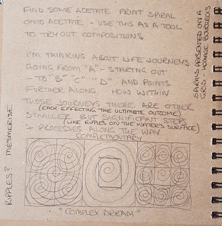
Louise Bourgeois: Spirals


I return to Louise Bourgeois’s work as a reference point for the use of spirals in my own work. I have used this symbol as a way of presenting my ideas about community and society in general, from the micro, rose petal pattern, to the macro level of representing a sense of community, rather than as symbols representing themes surrounding personal relationships, as Bourgeois has done.
In the Tate article the word “Control” (Tate. 2005) is mentioned, but rather than in respect of being the one under control, Bourgeois sees the spiral as representing her own sense of having control. In that respect it is a more subjective use of the symbol – presented here in the form of a grid. The minimalist use of primary colours gives them additional impact. I may consider using this device in my own presentations in future.
References:
Tate (no date) ‘Spirals’, Louise Bourgeois, 2005, Tate. Available at: https://www.tate.org.uk/art/artworks/bourgeois-spirals-al00346 (Accessed: 15 May 2021).
Sketchbooks


Part 4: Abstract Art: Research Point
Wassily Kandinsky

The above image, though not a finished outcome in itself, is readily recognisable as the work of Wassily Kandinsky. You can see the texture of the watercolour paper where the artist used a sketchbook to work out different colour combinations as a reference tool for later works. I can imagine this was a most useful piece of work: time well spent in researching how different colours worked against, or with, one another when seen together like this. It is a great example of how preliminary work is an important part of the process, and that rushing headlong to the finished article is seldom an optimal way to produce art. I will take from this the lesson to work up to a finished outcome using a sketchbook and to play around with colour and form. This, as well as useful and pertinent note-taking, will further enhance the effect of my outcomes as well as my process.
Mark Rothko

Mark Rothko is another artist obsessed with colour combinations. He used thin layers of different coloured oil paint to produce luminescent outcomes on huge canvasses. When hung in galleries and viewed, these outcomes produce, in me anyway, certain emotional responses, speaking directly to one’s subconscious. This is perhaps not surprising, as Rothko himself is reputed to have said that “Art, to me, is an anecdote of the spirit”. Seen here on this tiny screen the full import of these works is hugely diluted. As with so many works of art, you have to be there to fully experience the intended effect.
Jackson Pollock

There was method aplenty in Jackson Pollock’s “madness” here. The results of his famous drip technique are seen above. Again, the scale of this image has not translated well to a computer screen. A visit to the Tate to fully experience this piece is advisable. It speaks to me of graffiti art. There is a haphazard pattern in the movement of the punctured paint can as it deposits its contents over the canvas. This rhythm is analogous to the rhythm of life itself, or as its title says “Summertime”, the pattern is reflective of the seasons. Punctuated with primary colours, the black splashes are almost like an overly stylised font which attempts to communicate the unintelligible. It’s a fun, chaotic pattern, if that’s not too much of an oxymoron.
References:
Green and Maroon by Mark Rothko (no date). Available at: http://www.markrothko.org/green-maroon-1953/ (Accessed: 17 April 2021).
Jackson Pollock: 100 Famous Paintings Analysis and Biography (no date). Available at: https://www.jackson-pollock.org/ (Accessed: 17 April 2021).
Mark Rothko | Artnet (no date). Available at: http://www.artnet.com/artists/mark-rothko/ (Accessed: 17 April 2021).
Mark Rothko | MoMA (no date) The Museum of Modern Art. Available at: https://www.moma.org/artists/5047 (Accessed: 17 April 2021).
Tate (no date a) Jackson Pollock 1912–1956, Tate. Available at: https://www.tate.org.uk/art/artists/jackson-pollock-1785 (Accessed: 17 April 2021).
Tate (no date b) Wassily Kandinsky 1866–1944, Tate. Available at: https://www.tate.org.uk/art/artists/wassily-kandinsky-1382 (Accessed: 17 April 2021).
Wassily Kandinsky – 610 artworks, biography, books, quotes, articles (no date). Available at: https://www.wassilykandinsky.net/ (Accessed: 17 April 2021).
