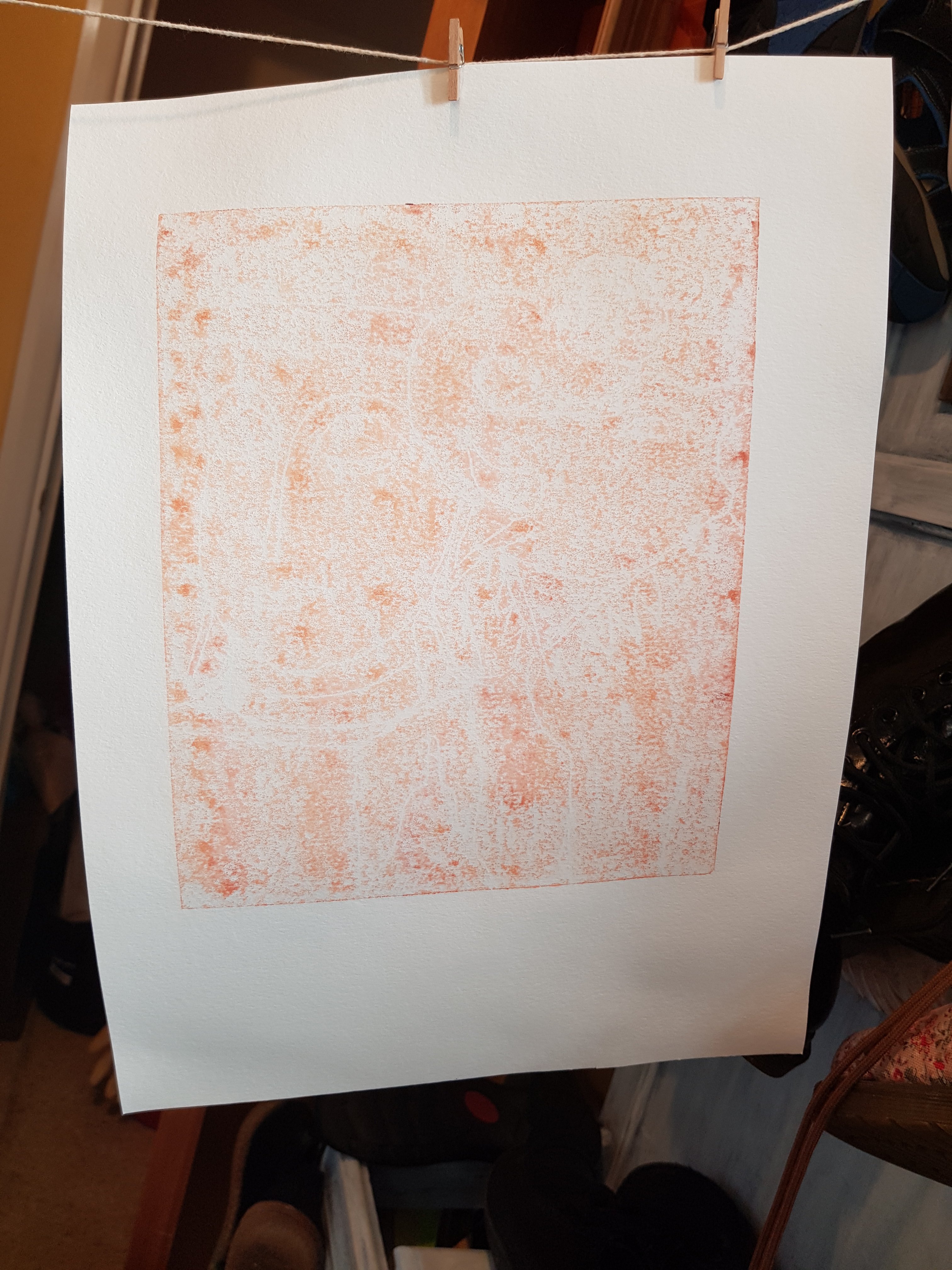
The above was taken this morning after seeking/receiving advice from Jim Westergard about speckled and patchy prints. This time I placed blotting paper between the felt blanket I was using to cushion the paper between the plate and the first wooden slab on my jack press. So, there was the plate placed face up on the platten. The Printmaking paper on top of that, then several pieces of blotting paper and then the blanket followed by the wooden slab and pressure supplied in the form of a car jack.
I feel there is slight improvement. There is a more consistent spread of the ink. However, I think I could make a better print if I were to gently sand the surface of the lino. I vaguely remember being advised this before, however a simultaneous email sent to the Printmaker and Illustrator Paul Catherall brought this back to mind.
In an ideal world I would have taken this crucial step prior to cutting my design, but lessons learned the hard way are more easily recalled I find. I shall need to take care to remove dust and debris from the cuts and the plate surface before attempting another proof. Also, the ink is very cold and I neglected to warm it through before taking this morning’s proof. I am attending to this now, and shall edit this post accordingly once this and further steps have been taken.
I shall likely test out the late light sanding step on an old attempt at lino cutting I carried out before starting the course.
Early linocut attempt
This produced the following proof following the same procedure with the blotting paper padding as before.
I’ve been aiming for the perfect print, but have yet to achieve this. The following are the best I could manage on Zerkal 120gsm Printmaking Paper.
Abbey View on 120gsm Printmaking Paper
I shall be submitting the above prints to my tutor as Task 2 (Project 6) for Assignment 2.
I had a couple of attempts at using Fabriano UNICA 250gsm Printmaking Paper which is quite textured. These had patchy results:
Abbey View on Fabriano 250gsm Printmaking Paper
I am very pleased with the composition. Perhaps, given the opportunity to redo this image, I would not cut outlines of trees as I have done so here. Instead of spikey white outlines, I would make the tree line more gently undulating. I think the image has impact – especially in black ink – and just enough in the way of contrast. There’s enough to keep the eye entertained as it travels top left down to bottom right. There is a noticeable diagonal too in the line of vegetation separating the solitary angler from the potential busy-ness of the allotment.
The theme of place has been met here by the significance of the location of what I have entitled “Abbey View” It was taken from a view of St Albans Abbey from the Alban Way – a much-frequented highway for pedestrians and cyclists alike (plus the odd skateboarder) – in leafy Hertfordshire. The reference photo was taken between lockdowns in 2020. It holds significance for me as it represents those freedoms, in our own back yard, which we take so much for granted. Our naturally “green and pleasant land” appears to have sent forth sentinels in the form of a virus, as though in an attempt to keep humanity in check.
Meanwhile, we try to go about our business as usual. We walk our dogs, pursue our pastimes; if so inclined, we visit places of worship full of the hope that this too shall pass.
I was tempted to call this image “How We Used To Live” after an old educational TV programme we used to watch years ago at my junior school in the mid 70s. But I decided against this as it felt far too portentous.
This piece is about how things are, how they once were, and perhaps, if we’re lucky, how they shall continue to be. It is my hope that this isn’t too fuzzy an explanation for the reasoning behind choosing this scene. On the surface it is a depiction of a scene of tranquility. Though I am no Christian, I hoped to convey, by the looming image of the Abbey, that a higher spiritual force is at work, and for this, and our environment, we as a species aught to be showing more respect.
I returned today to my single colour linocut of the View of St Albans Abbey. Using a flipped photo of my last proof, I drew onto a printout of this using a white gell pen. This gave me an idea of how dense my mark making should be around those areas I had highlighted yesterday. I made further cuts accordingly. I then took a proof as follows:
The unfortunate splodges are caused by remnants of vegetable oil used to clean the plate. These had become trapped in the grooves of the cuts and bled out onto the paper whilst in the jack press. I resolved, in future, to use white spirit to clean the plate itself, whilst still using the oil to clean the tools and equipment. However, this proof was sufficient to give an indication of where to go next.
I made more cuts in and around the vegetation at the bank of the stream and behind the dog walker, as well as the roofing on some of the huts. I then took a further proof as follows:
I shall make a few more cuts tomorrow morning concentrating on the allotment and the area of the stream. I am happy with the rest of the composition – except perhaps for the speckling effect on the treeline in the background – but on the whole I feel it is a successful image. I intend to proof one last time and then set about producing final prints in blue, blue-green and in black ink to submit for assignment 2.
I started with a photograph I had taken last summer – a south-eastern view of St Albans Abbey including some allotments. I’d decided my picture was going to be about the simplicity of a rural scene but depicted during these complicated and interesting times. This scene was captured last summer sometime after the first lockdown. Masks were not yet de rigueur. There were signs up to warn people to maintain their distance. I have included figures in my scene to lend interest to the foreground.
View of St Albans Abbey
I had been careful to think about transferring the drawing onto the lino and how it would become mirrored. In order to avoid this I first flipped the image on my phone. I then drew the above. Then I attempted to transfer it onto the soft polymer lino using graphite paper. However, when this failed to work, I simply drew a version of my drawing onto the plate with a black sharpie pen. When I’d finished, I realised I had drawn the incorrect orientation of the image. However, I looked at both versions and eventually arrived at the decision to leave it as it was, as the resultant print would likely depict a better composition and therefore an improved outcome. This would be due to the western convention of reading an image from top left to bottom right. The first thing to notice is the skyline with the Abbey itself. The eye then meanders its way down the image and exits via the pathway leading to the bottom right hand side. As it was also not that well known a view, I didn’t think the orientation would matter that much.
First cuts (incorrect, though preferred, orientation for printing)
Using my first test plate from Project 5 as a reference tool, I chose a Pfeil No 11 “v” shaped tool and cut outlines to key areas, as above.
I then took an initial proof onto newsprint.
Initial proof on newsprint
I made some decisions about how to proceed, and cut a little more using a Pfeil No 5 “u” shaped tool. These Swiss tools are very sharp and sit nicely in the hand making light work of the butter soft polymer lino.
Second proof on newsprint
At this point, I have decided to be a bit bolder about creating areas of contrast in the foreground. But I hesitate – slightly nervous of making a hash of it. I feel that my attempts at a “mackerel sky” are more evocative of an apocalyptic one. I shall take further steps to create slightly less texture in the sky and draw more attention to the foreground area, thus:
The coloured outlines surround areas for development. I’ll utilize varying degrees of contrast using more contrast than I had first intended
I cut the following (roughly A4) piece of lino using decent cutting tools.
Test linocut
I made the following notes as I cut:
Test cut notes
To clarify, in the top third of the 24 boxes in the grid, I have cut lines of varying depth and pressure using Swiss Pfeil tools numbered 5, 7 (wide), 7, 9, 11, 12 and 15. The wide and shallowly-curved Japanese chisel tool has been used just before the last Pfeil tool (No 15). It created some interesting zig zag lines when swiveled left to right as I cut.
Using this same sequence running from left to right on the next, or middle third, this time I have created various gouge marks. The Pfeil No 7s were very leaf-like when doing a zigzagging gouge. Pfeil No 15 is reminiscent of flames, I thought. I was intrigued to see how it printed.
Again, using the same sequence, I used all 8 tools to create cross hatching effects for researching “shading” purposes. I feel that the v shaped blades are most useful for the purpose of highlighting areas, but where not too much light is in evidence, rather than cutting a whole area of lino away entirely, which would suggest a very strongly lit area.
I learned much from this Exercise. I shall use this to inform my texturing on the next Project (6), aka Task 2. For this, due to COVID-19, I shall be falling back to a sketch I did recently of “Bottle Alley” in St Leonard’s-on-Sea sea front.
“Bottle Alley “
Update:
Change of plan. I shall hold back on using bottle Alley and save it for the multi-block print Exercise for Project 7 (task 3). This is because there is more scope for colour variety and layering on Bottle Alley which would add to interest. Instead I shall be using a sketch from the summer for the single plate linocut as follows:
I was hugely relieved to receive largely positive feedback on my first assignment for the Printmaking Module Part 1. Pleasantly surprised to have my Printmaking submission described as “exciting work”, I am motivated to move on with the next part of this module relating to linocut.
The critical feedback I received was useful in that my tutor has provided me with tools to develop my personal voice. She suggested I use mind mapping methods to brain dump my thinking around the reasoning behind the “Why” I chose certain objects. This should be by using universal language, rather than simply telling about the specifics of how those objects came into my possession. She said to ask myself pertinent questions about how I feel the work (both my own and historical/contemporary artists) could/will be interpreted by the viewer.
Again, I need to use this personal voice to communicate an intent at the outset in making decisions about the technicalities of the work, and the research underpinning it. Also, during production reflect upon how I feel about the printmaking outcomes as they emerge – that moment of magic. (I could also record mistakes and happenstance)
My tutor also mentioned paper stock (together with a link to a supplier of Zerkall 120gsm paper). She added that my use of cheap A3 photocopier paper was limiting the effects of the oil based ink I was using, which had led to an unwelcome blotchy effect on some prints.
Rather than listing the specifics of how I find objects, I could be describing what the assembled objects are about. Talk about the themes behind the work, whether it be family/memory/emotion/relationships in form, colour or texture etc. Does the work pose a question to the viewer, or seek to make a statement in some way?
I also need to do some wordpress blog admin – a dedicated space on my website menu – for recording/navigating Reflection on Formative Feedback as well as for the purposes of Research blog posts.
My tutor also said that the project 4 prints were by far the best in this submission, that I had saved the best until last.
I should continue to use my sketchbook to record daily observation in sketches and notes etc.
A selection of my backdrawn monoprints on A3 paper
Mind map the following:
The personal – specifics surrounding reasons for choosing a specific object or collection
the universal – how it may be viewed
the underpinning research – contextual studies
Technicality – paper, method/quality of inking, press, plate, spacing etc
To sum up my experience of monoprinting, if I’d had more fun with it, rather than cursing my lack of a perfect print, then this part of the printmaking module may have produced more positive outcomes.
For Project 1, I am submitting the following prints:
The “least bad” prints Project 1
These were produced by painting ink onto either a glass plate or one of copper. Clockwise from top left, these are printed on cartridge paper, newsprint, 120gsm Zerkal and basic A3 photocopier paper. The objects include a birthday gift of a sculpture from my sister, as well as the head of the Buddha – a rare gift from my younger brother – who found it in a skip on his way over to visit one day years ago. These objects have some degree of emotional attachment for me. Generally speaking, objects don’t hold emotional value for me particularly, though I do possess a lot of interesting objects in my flat. The pear is an ornament I picked up when out charity shopping with my partner, an example of a fun activity which we were once able to do freely.
For Project 2, I offer the following outcomes:
Project 2 Positive and negative masked monoprints
These are printed on white A3 photocopier paper, and on 140gsm black paper. From top left going clockwise they consist of a simple positive print from a negative mask (albeit white ink on black paper, just to confuse the issue), followed by a rare spotless positive print in yellow oil based ink on white paper. The next one is based on a sketch of the head of the Buddha and is a positive print from using a negative mask (again, somewhat confused by printing white on black). Finally, bottom left shows a negative print using a positive mask where the f holes in the violin have been cut out to show that extra detail.
The initial sketch of a violin was inspired by an instrument I have been practising for 3 years now. I am just starting to make actual music. The shape is particularly well suited for this exercise as it is so easily recognisable.
Project 3 Two coloured masked monoprints
For Project 3, I developed layers of positive and negative prints. Here I used bubble wrap to give texture to the background of the violin (bottom left). I was not entirely successful in registration of positive and negative prints in my outcomes, but I feel the effects are good enough to submit due to the colour combinations I have chosen to use. All of the above are printed on A3 photocopier paper using oil based ink. The print top left is my attempt at a landscape. Here I have used a brush to paint onto the plate as well as back drawing the clouds, thatched roof, and ploughed field.
There was a delay in awaiting a fresh order of supplies. I had a set which should have included oil based yellow ink, but in fact had 2 x black tubes instead. This was somewhat frustrating as I had to wait for my order to be delivered. But I am very pleased with the quality of the ink from Jackson’s. Needless to say that, in future I shall not be buying little sets on Amazon.
Finally, I am still working on Project 4. Please see previous blog post for the story so far. I shall update in due course, ever mindful that it needs to finished and dry for posting tomorrow (Thursday 14th Jan ’21) before noon.
Update:
This morning I have spent time attempting to finish Project 4 of Part 1, however the outcomes were not as good as I’d hoped. Rather than ask for another extension on this first assignment, which would be very last minute and not really on having already spent 3 months dithering I’m going to send what I have regardless.
Project 4:
Project 4
On reflection:
Although not ideal, I feel that to get a perfect, or near perfect, outcome with the monoprinting method is a tall order. I could spend six months on this and still not come up with anything I’m really happy with.
I am looking forward to the next part of this module where we are lino printing. Hopefully I will have the opportunity to put what I have learned so far into action in Part 2. I will not abandon monoprinting entirely, especially if my tutor directs me to rework my assignment. But it has been a largely frustrating experience. I’ll be pleased when I can move on.
For the last couple of days I’ve been playing with this design. I started with the following poorly defined ghost prints using leftover ink straight from backdrawn plates:
I then used a mask of the Buddha and the elephant to give some definition to the background in ultramarine blue:
Then, after they had dried sufficiently, I added a backdrawn outline using yellow mixed with a tad of ultramarine blue oil based ink:
I’m hesitant to add more layers to these as I risk spoiling them. But I think they could benefit from “sweetening up” using a bit of pink or lavender colour. It would help to bring out the green.
I’m running out of time. This first assignment is due to be posted on Thursday (day after tomorrow!) Though I can’t risk spoiling it, I can’t really send them as is either. Perhaps I shall test out my theory on the weakest version first to see what occurs.
Thinking about it, I feel I could have enjoyed this Part 1 of Printmaking 1 more if I’d been less precious about trying to get a perfect print. I intend to enjoy Part 2 more as it involves linocut, which is far less hit and miss than monoprinting. I’ve just placed an order for some assorted A3 coloured paper. I may do more experiments with monoprinting using these in conjunction with (or at least alongside) working through Part 2.
Today’s Printmaking session started off a bit rubbish, but went on to improve somewhat. I seem to be relearning what I’ve already learned – remembering to leave plenty white space, for example – as initially today’s prints were ill-defined at best.
In the above prints I returned to the technique of brushing the ink onto the plate (glass) but this time I used dampened paper to get as much of the ink as possible from the plate and onto the paper. Here I have used smooth Zerkal 120gsm paper and a textured Fabriano paper 250gsm.
I decided that the black background was far too heavy and opted for the lighter terracotta colour instead. But here I wish I’d left some white areas on the elephant so that it could be more easily recognized as such, rather than a peanut butter coloured splodge.
I had a break and returned, determined to pull something of value out of the morning’s work. The following prints were done on A3 photocopier paper. My intention was to produce masks from photocopies of my initial sketch:
These copies I placed onto the back of the A3 copier paper as it sat on the lightly ink rolled plate and I have then drawn onto the photocopy to produce backdrawn outlines of the design:
These I intend to build upon using layers and by masking areas using cutouts from the photocopies of my sketch.
Finally product a reletively clean print with no spots
I’ve spent the past couple of weeks attempting to build up print layers on multiple prints of the same image of a violin – apart from a slight deviation to play with the face of the Buddha which, as it’s a negative mask using white ink, is only really effective on black or coloured paper).
It has been a frustrating time as I’ve tried to perfect a spot free image each time. I used A3 photocopier paper as it was plentiful – having bought it at a car boot sale at a greatly reduced price. I had begun this part of the Printmaking Unit thinking to vary my paper more widely, as is suggested in the course text. However, I have had such patchy results that I abandoned this approach in Part 1 Project 1.
Patchy results
Yesterday I returned to part 1 and, using oil based ink, I was able to achieve the following images by first dampening the paper (Zerkal and cartridge) by soaking it for 10 minutes or so before printing on it. I had thought that this method would only be necessary for producing intaglio prints. I feel it’s useful for Monoprinting too if you are using oil based ink. If I had still been using water based ink, this would have been inadvisable, of course.
Ghost monoprint using oil based ink on dampened Zerkal Printmaking paper Monoprint using oil based ink on dampened cartridge paperMonoprint using oil based ink on dampened Zerkal Printmaking paperGhost monoprint using oil based ink on dampened cartridge paper
In the past week I gradually accumulated enough prints on which to experiment with second and third layers, allowing for “wastage” of those that may not make the grade.
Part 1 Project 2: Positive and negative masked monoprintsPart 1 Project 3: Two-coloured masked monoprints
Today I built up a third layer onto some of these prints in an attempt to create interesting textured effects
Above are a mix of monoprints using oil based ink on A3 photocopier paper. Methods include back drawing, the use of masks and bubble wrap to form impressions onto the inked plate before taking a print.
Tomorrow I shall do more of the same, using different colours and different objects for added texture.