I have tried to work out how Paul Catherall has achieved this lino cut which, to me, feels strongly reminiscent of cubist works by Georges Braque and Pablo Picasso. I have no idea whether George Orwell, the author of the book Down and Out in Paris and London, for which this image is the cover design, was an aficionado of Absinthe-fuelled meanderings in amongst the narrow streets of Montmartre. I haven’t read the book. However, this is how it makes me feel and think as a view this image. Even the colour of the ink used hints at the wicked green fairy. It does at least make me curious about the contents of the book.
The clean lines and overlapping colours suggest the character of both cities viewed through a slightly skewed lens. This is the image that first prompted me to revisit an earlier sketch I had produced during the previous unit Drawing Skills. My approach to this image, of several women engaged in yoga warrior poses, had been inspired by the work of the cubist movement. I had first experimented with layers on my multi-colour linocut in the previous part of the intro to Printmaking unit. Paul Catherall’s work was very much in mind as I designed and cut the lino for Bottle Alley. I then used his work as a springboard to start a larger scale image for the theme of Life Form with several figures.
Paul Catherall’s image is a consistently skewed view without any figures present. My image of Yoga Warrior Poses is a little confused by comparison. Limbs intermingle. Some of my figures appear to have essential limbs completely missing, whereas others have more than their fair share. Also, I feel I have produced something with inadvertently salacious undertones in that the figure on the left appears to be about to strike the bared and vulnerable rear of another, more central figure. I have spent too much time on this, however. Although the outcome is not ideal, it does have some interesting shapes and colour combinations.
Since starting this reduction lino cut, I have reviewed my degree pathway choice. I have been transferred from the Drawing Pathway to the Illustration pathway. While I take both seriously, I feel myself breathe a huge sigh of relief in the fact that Illustration feels so much more apt to my approach to mark making. To me, art should be a fun activity. Art with a capital “A” always appears to be so serious.
Paul Catherall’s work, used here for illustration purposes for the Orwell book, would comfortably straddle both art camps. It is both commercial and manages to convey a glacially cool quality to recognisable pieces of architecture such as Tate Modern and Battersea Power Station. This artist shows the simple beauty that is not always immediately apparent in such structures. He does this in a seemingly effortless way by selection and simplification of its most prominently recognisable features. This is what I appreciate about the work he produces, that simplicity equates to beauty.


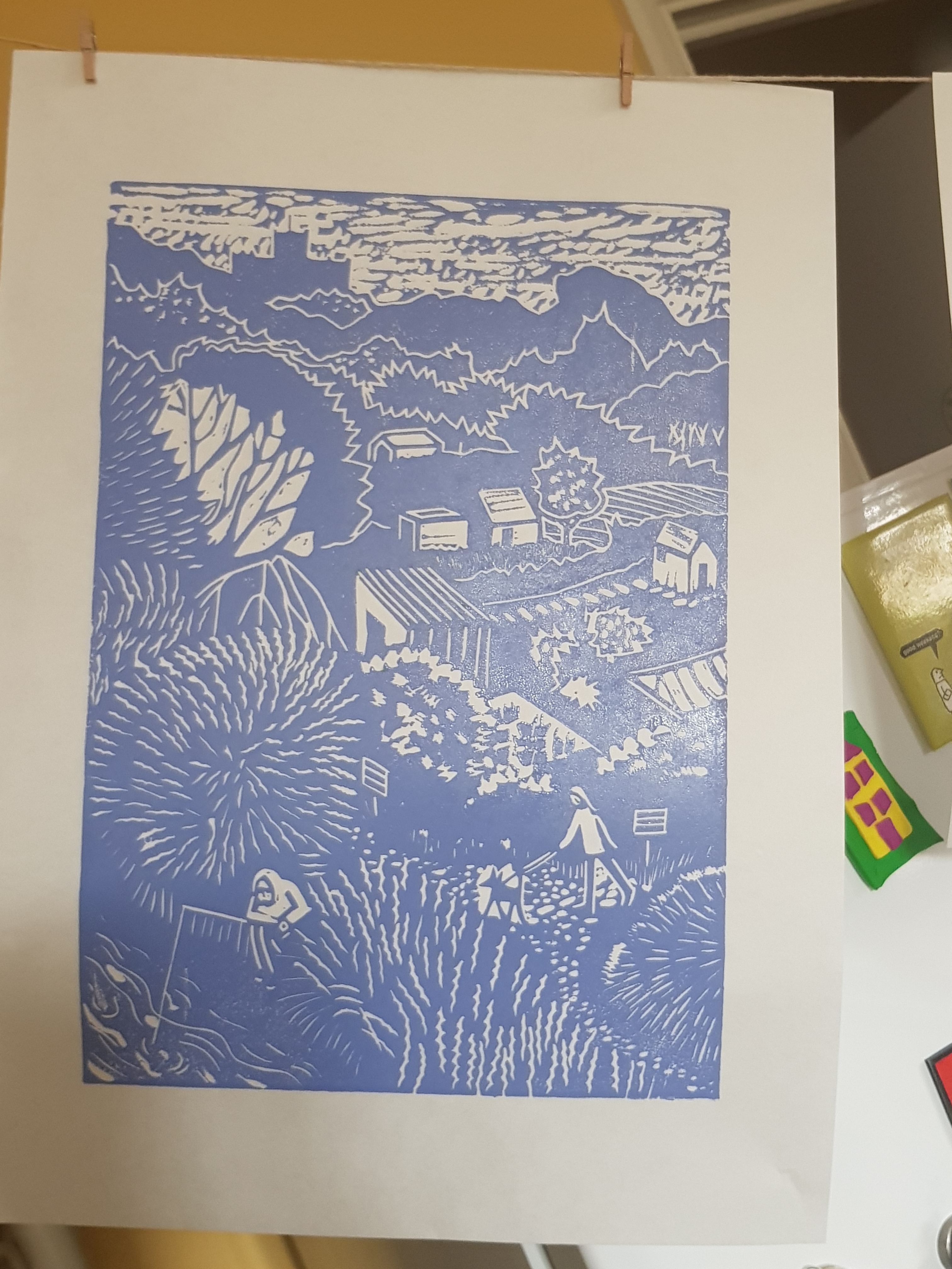
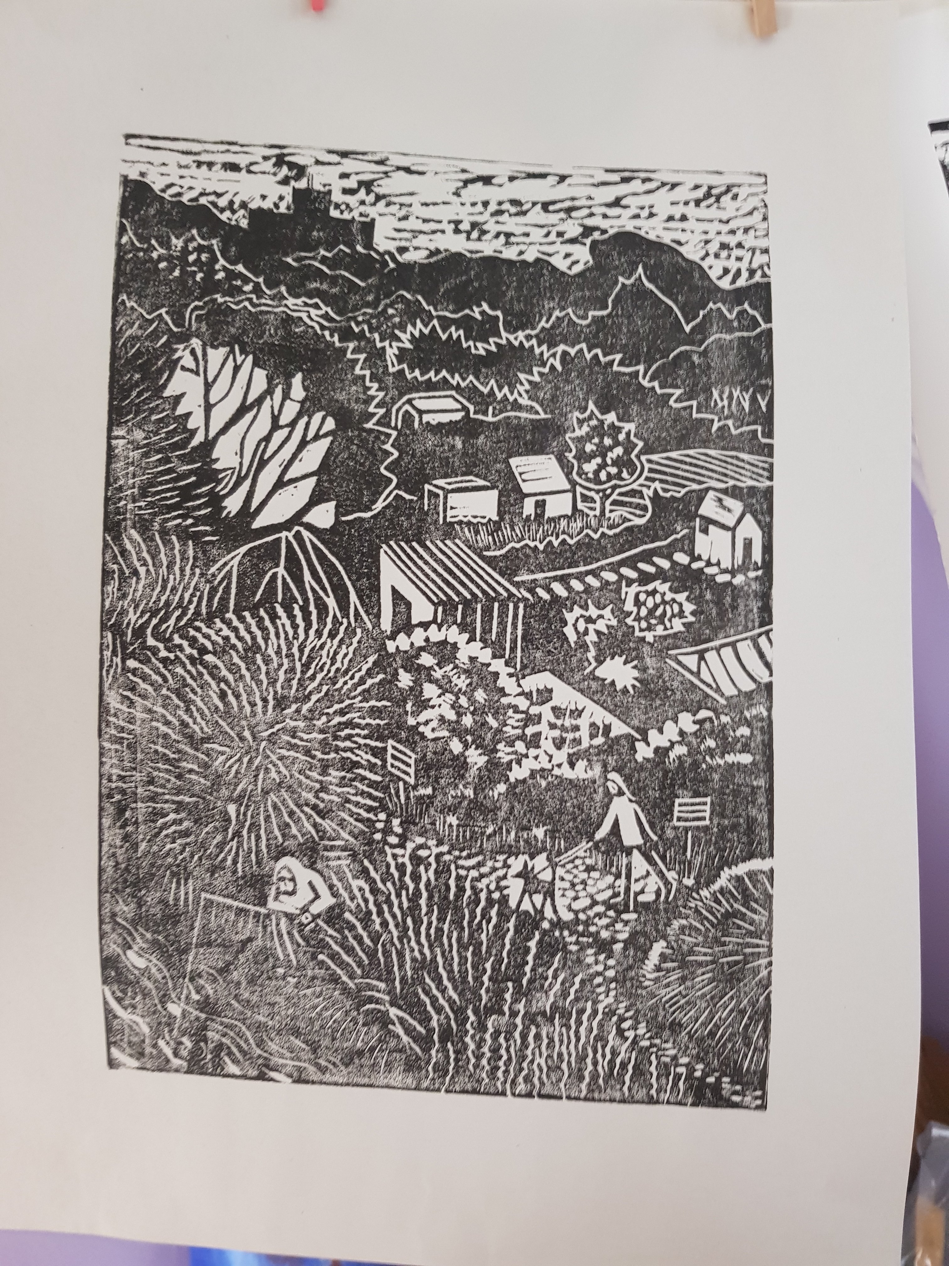
I’m not certain that I have achieved this level of effortless simplicity in my rendition of the yoga poses. Bottle Alley however, is simple and suggests a sense of emptiness and isolation that is inherent in an out of season seafront in an impoverished town during lockdown.
References:
Paul Catherall RE, Down and Out in Paris & London (no date) Bankside Gallery. Available at: https://www.banksidegallery.com/artists/181-paul-catherall-re/works/18966/ (Accessed: 18 March 2021).
George Orwell (2013) Down and Out in Paris and London. Penguin Modern Classics.