


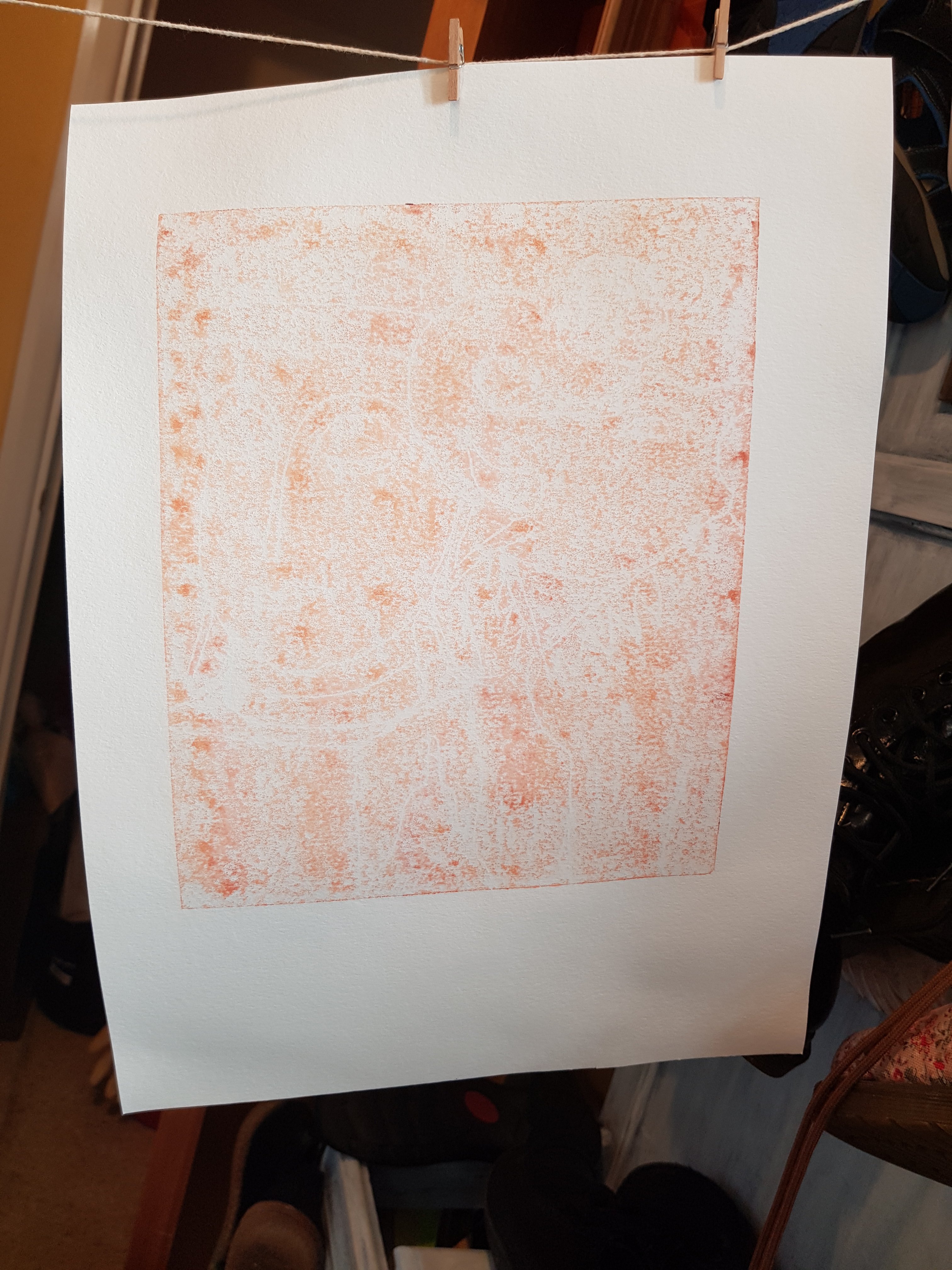
For the last couple of days I’ve been playing with this design. I started with the following poorly defined ghost prints using leftover ink straight from backdrawn plates:


I then used a mask of the Buddha and the elephant to give some definition to the background in ultramarine blue:


Then, after they had dried sufficiently, I added a backdrawn outline using yellow mixed with a tad of ultramarine blue oil based ink:


I’m hesitant to add more layers to these as I risk spoiling them. But I think they could benefit from “sweetening up” using a bit of pink or lavender colour. It would help to bring out the green.
I’m running out of time. This first assignment is due to be posted on Thursday (day after tomorrow!) Though I can’t risk spoiling it, I can’t really send them as is either. Perhaps I shall test out my theory on the weakest version first to see what occurs.
Thinking about it, I feel I could have enjoyed this Part 1 of Printmaking 1 more if I’d been less precious about trying to get a perfect print. I intend to enjoy Part 2 more as it involves linocut, which is far less hit and miss than monoprinting. I’ve just placed an order for some assorted A3 coloured paper. I may do more experiments with monoprinting using these in conjunction with (or at least alongside) working through Part 2.
